PLEASE NOTE: This analysis is based on an initial estimate of the 2018 electorate and should NOT be used for comparative purposes now that updated data are available. An archived version of Catalist’s 2018 estimates is available here. For current data, see Catalist’s latest analyses.
November 9, 2018
Author: Yair Ghitza, Chief Scientist
Last week, I shared the news that we at Catalist have developed a new methodology for more accurately capturing the true shape of an electorate, almost immediately following Election Day.
Today, we’re pleased to share a first look at the story told by this new data. We’ll release more findings — including data on candidate choice and more detail from selected state and congressional district s— in the coming days and weeks.
Understanding the shape and preferences of the electorate is critical for both analysts and practitioners alike, given the imperfect information we have often had to work with in the past, and the weight that information bears in our subsequent strategic planning for future elections. For example:
- Exit polls, while usually the first data released, have historically been less reliable in measuring the demographic composition of voters. In 2016 and earlier, we believe they dramatically understated the size of the white non-college vote, for example. This year’s exit polls have tried to address this by explicitly weighting by education level, which is a huge step forward.
- While data from official voter registration records is often the absolute best source for this information, it is not available until several months after Election Day, long after public attention has moved on.
As a refresher, or if you’re curious, you can read more about our new methodology in our initial post. In short, we spent the last few days combining all of the information available — pre-election projections, early voting, county and congressional district election results, and precinct results where we have it available — to come up with the most reliable turnout estimates available, at least until more voting data is released by Secretaries of State next year.
For now, we start with the very simple question of who actually voted in the November 2018 midterm election?
1. The 2018 electorate was younger than in 2014, though not as young as exit polls suggest.
Exit polls and anecdotal reports suggested a surge in youth turnout this year. Our data so far suggests the same thing. Exit polls still skew younger than our data, continuing a trend that has persisted for many years. But we see an increase in youth turnout (ages 18–29), from 8 to 9% of the electorate. Looking at all voters under the age of 40, the increase is from 19 to 22%.
Composition of the electorate: Age

2. The 2018 electorate was also more diverse, with African American and Latino communities surpassing their share of votes cast in 2014.
We also see a more diverse electorate, substantially more so than in past midterms in recent years. We estimate that communities of color rose from 21% to 24% of the electorate this year, with gains coming across multiple groups. We do find that the midterm electorate remained more white than in 2016, although our estimates for 2018 match the 2012 Presidential election. Compared to the exit poll, our data does show an electorate with more white voters overall, which has been true for some time, across multiple datasets.
Composition of the electorate: Race

3. Voters in 2018 were more educated than all the years in our dataset going back to 2006
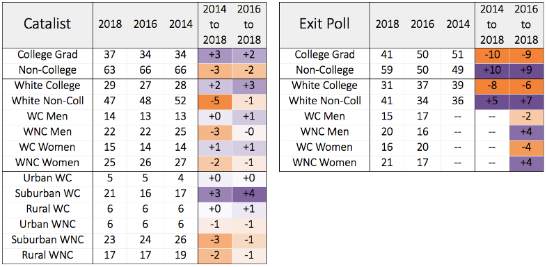
The share of voters who are college educated increased by 3 percentage points between 2014 and 2018, continuing a slow and steady trend of the electorate becoming more college-educated over time.
It is worth noting that the exit poll shows the opposite trend. As noted earlier, they substantially changed their weighting scheme on education levels, so these groups can’t be reliably compared across years in the exit poll.
While white voters as a whole decreased as a share of the electorate, that drop came entirely from white non-college voters, a 5-point drop in composition. White college voters grew by 2 percentage points, in contrast, more-so from white college-educated women. Much of the gain among white college voters came from the suburbs, growing from 17% (2014) to 21% of the electorate. This was also a larger share than in 2016.
Composition of the electorate: College, Race, Urbanity

So, what now?
In the days and weeks ahead, we will continue to revise these projections and will share similar estimates for select statewide and congressional races as they come together. In some parts of the country, we are still waiting on a settled outcome, and in many others, high numbers of uncounted ballots are still missing from the official vote tallies. Of course, we want our analysis to reflect these late-breaking, real-world events, but we’ll move forward as quickly as we can.

