December 5, 2018
Author: Yair Ghitza, Chief Scientist
A few weeks ago, we released the first round of analysis on the 2018 election. Since then, we’ve been doing a few things: updating those models as election results have continued to be collected, and extending our analysis down to states and congressional districts where precinct data is available. Here is a brief update on where we stand and what to expect next:
First, we just updated the national congressional data that we posted a few weeks ago. This mainly1For transparency (and careful readers/analysts who download the data), we also cleaned up some backend data/modeling issues that came up as we continued to analyze the data. For example, birthdate is missing from only 1% of records on the voter file nationally, but more in some states. We have to impute an estimated age for these missing records — this doesn’t affect things much at the national level, but it can be important in places with lots of missing data. We noticed a problem in how some of the imputed age records were computed and fixed it for this round of analysis. reflects the additional results that have come in since we posted. The Democratic margin of victory increased as more results came in, and we see that reflected in many of the voting blocs shown in the spreadsheet. Qualitatively, little has changed: our estimates only changed by a point or two for each reported group.
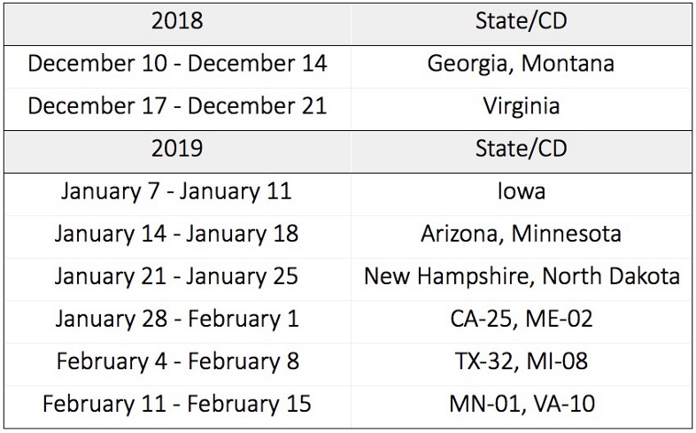
Second, this week we will begin publishing analysis of states and congressional districts, starting with the Georgia governor’s race. Here is our tentative publication schedule. More states and CDs will be added as more precinct data comes in, along with official turnout data from the Secretaries of State around the country.

This shows our plan for specific elections, but we’ll also have posts about more general trends that we’re seeing across the country. Some will describe technical pieces of our data; some will describe political/substantive trends; and some both.
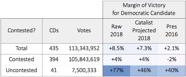
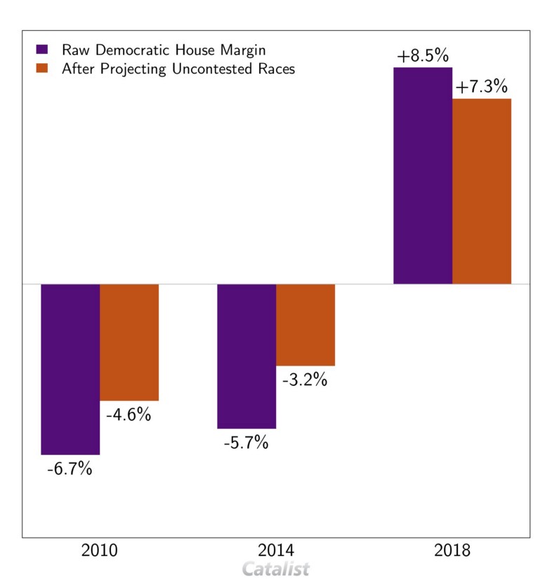
For example, we’ve gotten some questions about our national topline number for Congressional races in 2018. Our current data shows Democrats winning the national vote by 7.3 points, while the most up-to-date raw results show an 8.5-point margin. What gives?
Uncontested elections skew the national topline, by about 1 point in margin in 2018.

The raw results include both contested and uncontested races. While this certainly reflects the “official” result, we feel that the contested races skew many of the demographic comparison points that we care about. There were 41 uncontested races this year2We define “uncontested” races as any race without either a Democrat or Republican candidate. Some of them have third party candidates, who only received 9% of the vote across the districts, with none receiving more than 30%., and they tilted heavily towards Democrats, who won 38 of them. The raw results show a 77% Democratic margin in those districts, where the margin was only 40% in the Presidential race in 2016. Although these districts are heavily Democratic as a whole, the artificially high margin moves the national margin up by about a point. Importantly, this bias is different across different demographic groups. African Americans are more likely to live in uncontested districts, for example, so their “raw” numbers would be more biased than White voters. The problem is compounded when comparing results to say, 2014, when the uncontested races skewed the other direction, towards Republicans.
To account for this, we project turnout and candidate choices in contested elections, based on survey data and trends that we see across the country. In 2018, we project a 46-point Democratic margin in the uncontested races, which reflects the better national environment for Democrats in 2018 than 2016.

Broadly speaking, this correction reduces the swings that we see from election to election. The chart above shows the raw and adjusted margins for the past three midterm elections. The raw data shows a swing of about 14 points from 2014 to 2018, while the adjusted data shows a smaller swing of about 10 points. We think the 10-point swing better reflects the change in public opinion that we care about most. Most importantly, the adjusted data is reflected in the demographic differences seen in our results.
More to come!

