WHAT HAPPENED IN 2024
AN ANALYSIS OF THE 2024 PRESIDENTIAL ELECTION
Introduction
Catalist’s What Happened reports offer a comprehensive voter-file based view of the electorate after every major presidential and midterm election. Our 2024 report is based on publicly available vote history data and precinct-level election results from every state and Washington, DC — which are only made available in the weeks and months after votes are counted — as well as Census data, and Catalist’s proprietary modeling and polling, which are all used to estimate the composition and partisan leanings of the electorate from the precinct to the national level.
This analysis focuses on major demographic trends in the U.S. electorate, with a particular focus on the 2024 election and electoral trends since 2012. The sections are devoted to turnout and major party support, followed by deep-dives into major demographic categories and notable changes at the subcategory level. Some findings are repeated in the analysis depending on the main demographic lens through which they are being discussed. The report then focuses on voting patterns based on the frequency of participation in elections and related engagement with the political process, turnout and vote choice. It concludes with considerations for campaigns and practitioners in the coming years.
Contact Catalist
If you’re interested in more data on the 2024 electorate, including at the state and local level, please contact us.
This report’s interactive graphics are best viewed on desktop. Mobile users can scroll larger charts by swiping the very top or bottom of the visualization, usually around the legend area. You can also view and download a .pdf version of this report.
The report also includes a detailed Methodology section that addresses common questions about how voter files denote specific types of demographic data and more resources on the statistical methods used to build this analysis.
Finally, a topline data file is available for the national-level analysis, which also updates some estimates for prior election years. Catalist offers analysis at more specific levels for academic research, media, progressive causes and Democratic campaigns. Organizations that are interested in obtaining more data or sponsoring more analysis should contact us.
©Catalist
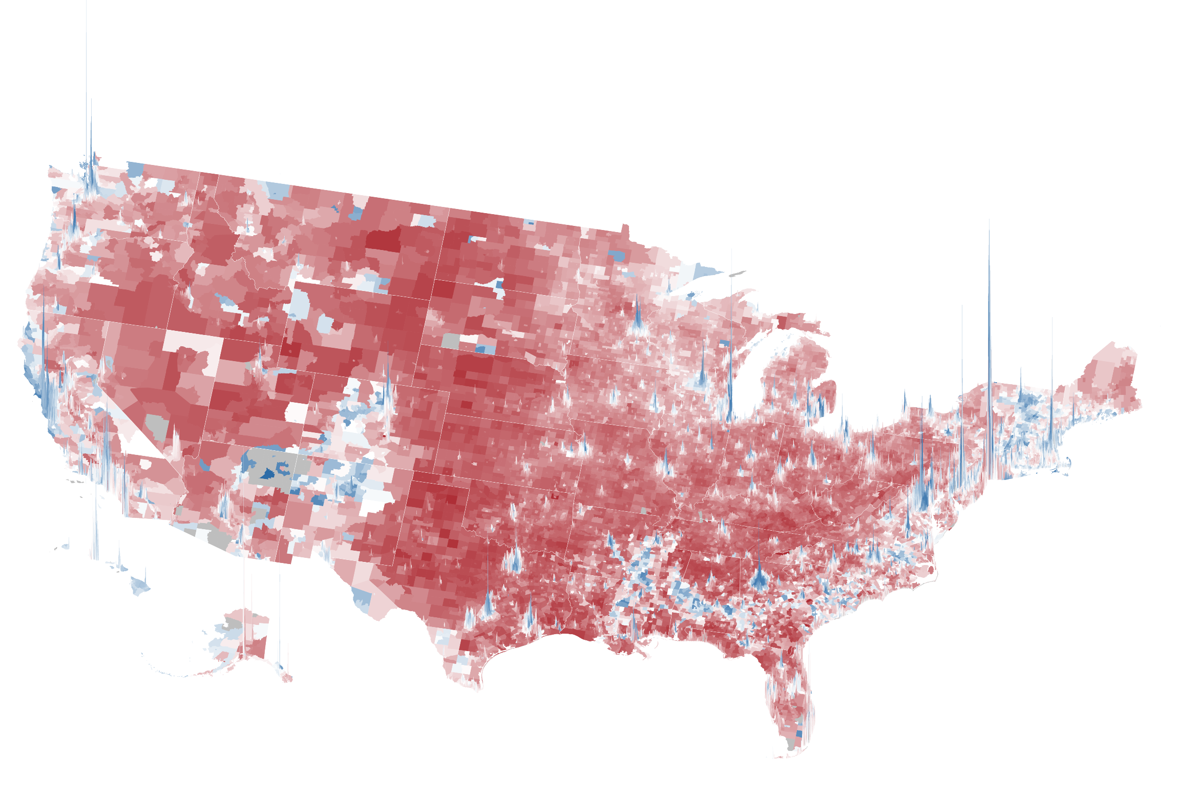
The Catalist voter file view of census tract-level election results for the 2024 general election. Areas with a stronger Democratic lean are blue while areas with a stronger Republican lean are red. The height of the columns represent population size.
Executive Summary
This analysis focuses on the 2024 presidential election, which despite its unprecedented nature – from a candidate switch to an assassination attempt to recovery from a global pandemic – demonstrated a continuation of many demographic trends from the past several cycles.
Overall, we find that the Democratic Kamala Harris / Tim Walz ticket retained key parts of the Biden 2020 coalition, but at lower levels among a specific, interconnected set of subgroups, including young voters, men, voters of color, less frequent voters, urban voters, and voters living outside the major battleground states. No single demographic characteristic explains all the dynamics of the election; rather we find that the election is best explained as a combination of related factors. Importantly, an overarching connection among these groups is that they are less likely to have cast ballots in previous elections and are generally less engaged in the political process.
While these groups tilted toward Donald Trump and JD Vance, Harris retained support among more consistent voters, particularly in battleground states. Together, these dynamics allowed the Trump / Vance ticket to secure a narrow popular vote plurality and a sweep of the major swing states.
Voting and Political Engagement
The frequency with which someone participates in elections is one of the most visible forms of political engagement, especially on state-level voter files. Various political behaviors are also correlated with voting and vote choice, such as media consumption, political discussions with friends and family, and participation in other forms of political activism. In this report, we focus on voter file-based measures of political engagement, specifically voting in elections. Further, we refer to irregular voters as those who have missed at least one of the last 4 most recent general elections in which they could have cast a ballot.
Key Findings
Turnout remained high, especially in battleground states, and especially in Republican areas. National turnout was 64% of the voter eligible population, nearly matching 2020’s historic turnout.1 Definition of the voter eligible population and topline turnout statistics are from United States Elections Lab data compiled by University of Florida political scientist Michael McDonald. In the seven major battleground states turnout was more than 70%, exceeding both the national turnout rate and the battleground state turnout rate for 2020. Even though turnout was high overall, there were differences between groups. Turnout in Republican areas dropped less than in Democratic areas across both battleground and non-battleground states, and turnout remained higher for white voters than voters of color.
Battleground States
Throughout the report, we will refer to the following states as the battleground states – Arizona, Nevada (Southwest), Michigan, Pennsylvania, Wisconsin (Midwest), Georgia, North Carolina (Southern). These were widely recognized to be the core battleground states of 2024.
Many voters changed their partisan preferences, from supporting Biden in 2020 to Trump in 2024. Harris lost vote share among the interconnected set of groups described earlier, including younger voters, men, voters of color, and infrequent voters. Trump did particularly well among these groups of voters, even in comparison to other Republicans in recent years. Shifts in turnout and shifts in voters’ partisan preferences both contributed to the final election outcome and these trends relate to one another across demographic groups and subgroups.
Harris continued to do well among voters who have consistently participated in elections. Compared to Biden in 2020, Harris retained support among voters who regularly cast ballots in recent elections. Harris also retained steady support among some demographic groups, particularly women and older voters in the battleground states.
Trump’s gains from 2020 were smaller in battleground states. While Trump did not secure an overall majority of the popular vote when accounting for all ballots cast, his performance improved in two-way support, which looks at only ballots cast for Democrats and Republicans. In 2020, he received 49% of the two-way vote and increased that share to 52% in 2024. However, his gains in the battleground states were about half the size, going from 49% to just over 50%. The major trends against Democrats in the election were mitigated in the battleground states – turnout was higher, support losses were lessened – which may be related to higher levels of campaign activity and more frequent election participation in these states.
Voters of color continue to support Democrats, but support has dropped successively over the past three presidential elections. Voters of color remain a key part of the Democratic coalition, with Black voters in particular continuing to support Democrats at the highest rate among all racial groups. But over the past several general elections, Democratic support has continued to erode among voters of color. Drops from 2020 to 2024 were highest among Latino voters (9 points in support), lowest among Black voters (3 points), and 4 points for Asian and Pacific Islander groups (AAPI). Support drops were 5 to 6 points among “Other” voters, a category used in election analysis that includes Native Americans, Middle Eastern and North African voters (MENA), and multiracial voters, which is often difficult to meaningfully disaggregate at the national level due to relatively low population sizes. As with other demographic groups, support drops were concentrated among the younger cohorts of voters, particularly young men. For instance, support among young Black men dropped from 85% to 75% and support among young Latino men dropped from 63% to 47%.
White voters remained over 72% of voters, the same as 2020, and Harris also lost support among some of these voters. We also see a 2 point drop in Harris’s support among white voters, which had an outsized impact on her overall performance given the size of the white voting population. These losses were concentrated among specific sets of white voters – irregular voters, young voters, and men. Harris also saw support drops among white men with a college degree.
The partisan gender gap remains high and grew in 2024. Women have long been more likely to support Democrats than men. The gender gap in partisan preferences increased in 2024: women continued to support Harris (55% support) at roughly the same levels that they supported Biden in 2020 (56%). But men moved towards Trump in 2024, from 48% support for Biden in 2020 to 42% support for Harris in 2024. These changes were seen across racial and other demographic groups.
After years of historically high support among Democrats, a significant share of young voters swung toward Republicans. Voters under the age of 30 dropped from 61% Democratic support in 2020 to 55% in 2024. Similar support drops are evident when examining voters by generational cohorts, such as Gen Z or Millennials. These drops were larger than drops for any other generation or age group, and other trends in the demographic data, such as drops among different racial groups and the gender gap, were more pronounced among young voters than the rest of the electorate.
Education polarization remains high, but decreased slightly in 2024. As Trump has gained prominence over the past eight years, American elections have been increasingly defined by increased Republican support among voters without a college degree and increased Democratic support among voters with a college degree, especially among white voters. These trends held in 2024, but were slightly muted compared to 2020. For instance, white college-educated men supported Harris at lower levels (45%) than they supported Biden in 2020 (50%), particularly in non-battleground states.
The urban-rural divide remains strong, but Democrats did worse in cities in 2024. Similar to the education divide, Democrats have done better in cities and Republicans have done better in rural areas for many years. In 2024, Republicans continued to do well in rural areas, but Democratic support dropped in cities, particularly in non-batteground states. These drops are related to other trends in the data, particularly the drops in Democratic turnout in major metropolitan areas.
Putting these trends together, Harris lost in 2024 due to a combination of support and turnout drops among key groups, particularly “rotating voters.” The nature of Democratic coalitions is different from Republican coalitions. In recent years, successful Democratic elections have seen a combination of (1) support shifts towards the Democrats among core regular voters, and (2) a consistent refresh of new voters that lean towards Democrats – including young people, voters of color, urban voters, and people who move regularly. In 2024, Harris lost support among presidential repeat voters, meaning those who also voted in 2020, and the new set of “rotating Democrats” did not materialize as they had in previous elections. Importantly, these groups of voters overlap in many ways and we discuss the strategic implications of this data and how campaigns engage voters along a variety of interrelated channels that go beyond simple “mobilization” or “persuasion.”
Looking Ahead
Demographics are not destiny. Campaigns, parties, and voter outreach organizations marshall resources to try to build winning coalitions across geographies and demographic groups.
Other Republican candidates have not been able to replicate Trump’s ability to reach the less frequent voters in his coalition. Future candidates may not be able to do so either, but these voters are still more visible to Republican campaigns than they were before 2016.
We encourage voter outreach organizations, campaigns, academics and other election analysts to embrace experimentation. Our ability to reach voters has expanded dramatically over the past decade, but competition for people’s attention in a shifting media environment has also presented new challenges and opportunities as audiences have continued to fracture and segment.
Organizations that are interested in obtaining more data or sponsoring more analysis should contact us.
Turnout: A Tale of Two Electorates
The 2024 election was a continuation of incredibly high turnout following Trump’s surprising victory in 2016, particularly in the battleground states. Since the start of Trump’s first term, voters have remained highly engaged in the political process.
According to data from the United States Election Lab compiled by University of Florida political scientist Michael McDonald, shown in Figure 1, voter turnout spiked from 60% in 2016 to 66% in 2020 – the highest voter turnout in over a century, higher than any election since women’s suffrage and the Civil Rights era. Turnout dropped to 64% in 2024, but this drop was concentrated in non-competitive states, with some battleground states exceeding their 2020 turnout.
Figure 1: Voter turnout, as a percentage of the Voting Eligible Population (VEP), from United States Elections Lab data compiled by University of Florida political scientist Michael McDonald. Elections have had historically high turnout since Trump was elected in 2016, particularly in battleground states.
Recent presidential elections have been remarkably stable, with a relatively consistent set of competitive states since at least 2016. Among the 7 battleground states in the 2024 election, turnout increased slightly, from 70.1% in 2020 to 70.5% in 2024.
Turnout is highest in presidential elections, but a similar trend can be seen in the midterms. Before Trump was elected, turnout was 37% in the 2014 midterm; after Trump was elected, midterm turnout spiked to 50%, only slightly dropping to 46% in 2022. Across the 2024 battleground states, historic midterm turnout was higher overall, and remained high – 40% in 2014, 53.1% in 2018, and 53.3% in 2022.
Why do battleground states have high turnout? The consistency of the battleground states over recent years is uncommon in American history. Increased investment, including higher levels of campaign spending, as well as consistent attention from campaigns, independent organizations, and media over a long period of time have contributed to more people becoming involved in the political process. Further, voting is habitual. After multiple cycles of investment emphasizing the national significance of their votes, these voters may be developing stronger voting habits, which has implications for future investments.
Voter turnout was high in the battleground states, but not consistently so, which ultimately benefitted Republicans. Figure 2 shows turnout change from 2020 to 2024 by census tract.2 We use census tracts for various cross-year comparisons because it is a small geography that is consistently coded on our voter file across years. Wherever we use census tracts in the report, we use pre-2020 census lines. The graph shows turnout change compared to 2020 Biden support. In non-battleground states, shown in black, turnout was about the same as 2020 in Republican areas, while it dropped by as much as 15% in Democratic areas. This was fairly obvious shortly after the election, looking at state-level and county-level turnout. What was not as obvious was the trend in battleground states, shown in red; here, the turnout advantage in Republican areas was nearly as strong, but these areas also voted at relatively higher rates compared to non-battleground states. Specifically, within the battleground states turnout in Republican areas increased by as much as 5%, while turnout in Democratic areas decreased by as much as 5%.
We see related trends in individual-level data. Figure 3 shows how much turnout went up or down for groups based on race and gender.3 These estimates are constructed by projecting the citizen voting-aged population (CVAP) as the denominator, using data from the American Community Survey (ACS). As of this writing, ACS data is released through 2023, so we use a simple projection with generalized additive models (GAMs) for each group. One major complication arises because the Census changed the wording of their race question in 2020, resulting in substantial increases in the number of estimated multiracial people in the population, pre- and post-2020. To make turnout estimates comparable over time, we code every multiracial person as their non-majority race; i.e., if someone is coded as AAPI and White, they are coded as AAPI in the denominator here. For the numerator, we use Catalist’s race model, which was constructed using a similar coding scheme. Because of these changes, the raw turnout rates for each year are not directly comparable to other sources of turnout data, such as the Current Population Survey Voting and Registration Supplement. Similarly, the coding changes in the Census cannot be easily reconciled for Native Americans; we do not have confidence in our turnout numbers for this group because of these changes, so they are excluded here.
Examining the data in the first part of the chart, we see white voters have had higher turnout than voters of color and that trend continued in 2024. Compared to 2020, their turnout stayed relatively steady, dropping by about 1%. Among voters of color, Latino turnout dropped the least, by 3% compared to 2020. Black voter turnout dropped by almost 6%, and AAPI turnout dropped by almost 7%, after increasing substantially in 2020. Among white voters, turnout dropped more for men (1.8 points) than women (0.6 points) whose turnout rate barely changed from 2020. Among voters of color, the gender differences were small.
The story in the battleground states was related, but with increased turnout across the board. Both white and Latino voters in the battleground states increased their turnout rate, by about 1.5 points and 1.3 points respectively. Black and AAPI turnout was down compared to 2020, but only by 1 to 2 points. Among white women, turnout was up by more than 2 points.
Support
While shifts in turnout were an important factor in Trump’s victory, some demographic groups also saw significant declines in Democratic support from 2020 to 2024. This section details the scope of those losses across different groups. We find that Harris lost the most among an interconnected set of groups: people of color, young voters, men, and irregular voters. These trends are explored further in the sections on Irregular Voters, Churn and New Voters.
In all three past presidential elections, Trump has made varying inroads among these voters, more so than previous Republican presidential nominees, while a disproportionate number of these voters seem to drop off during midterms when Trump is not on the ballot.
As an illustration, Figure 4, shows how much support Harris lost compared to Biden 2020 among a key set of groups. Across the country, she lost 3 points, going from 52% to 49% support overall (See Methods for more on calculating two-way support). Those losses were substantially larger among Latinos (9 points), young voters (5 to 6 points), men (5 points) and irregular voters (5 points).
Importantly, it would be a mistake to consider these demographic attributes one at a time. For instance, Latinos are more likely to be irregular voters than white voters, young people are less likely to vote in midterm elections, and Latinos are more likely to be young. In other words, these groups overlap considerably. Further, groups that had a combination of these traits were more likely to move away from Harris. Among young Latinos, Harris lost 12 points; among young Latino men, 16 points; among young Latino men who are irregular voters, 17 points. Similar trends are evident across other combinations of these groups and sub-groups, including along racial, gender, age and vote history lines.
Figure 4: Changes in support levels from Biden 2020 to Harris 2024, among a selected set of groups. Harris lost the most among an interconnected set of voters, including those who cast fewer ballots in recent elections, in this case, voters who missed any one of the last 4 general elections in which they could have cast a ballot. These groups overlap, and she lost the most support among groups with many of these traits.
In contrast, Harris maintained support among a different set of voters: women – white, Black, and older women in particular – and consistent voters who are the most engaged in the political process. This group of highly engaged voters have been trending towards Democrats over the Trump era and showed little change in support over the last four years.
Other Elections
This analysis primarily focuses on the top-of-ticket contest between Harris and Trump. In Arizona, Michigan, Nevada, and Wisconsin, Democratic Senate candidates won their races despite Trump carrying their state. Generally, the same interconnected groups that dropped support for Harris from Biden in 2020 saw less steep drops for Senate candidates. These outcomes are a result of ticket-splitting, in which voters cast ballots for different party candidates, as well as voters who only cast ballots for president (ballot roll off) or who only cast ballots for lower-level offices (undervoting). Democratic House candidates in heavily contested districts also tended to overperform the presidential tickets; overall, there were thirteen Democratic districts where Trump led the presidential vote and just three Republican districts where Harris won.
Voters largely expressed support for abortion rights in the 11 states that had ballot referenda. Consistent with historical trends, ballot measures on abortion tend to overperform pro-abortion-rights Democratic candidates.
Race
Election analysis tends to focus on several broad racial categories, largely as defined by the U.S. Census Bureau, including white, Black, Latino, Asian American and Pacific Islander (AAPI), Native Americans and others. These categories are not meant to be exhaustive or determinative. (A fuller discussion of how voter files analyze race data is included in the Methodology section.) Throughout this section, we discuss major findings for each group, then discuss the most significant movements among subscategories for that group based on other demographic factors such as age, gender and education.
Participation and Coalitions by Race
The U.S. electorate has grown more diverse over time, with voters of color comprising a fractionally larger share of the electorate each cycle as their population has increased, especially Latino and AAPI voters. However, the electorate remains less diverse than the country as a whole.
Over the past several election cycles, Democrats have retained their multiracial coalition while Republicans have significantly diversified their own coalition. In 2012, when former Massachusetts governor Mitt Romney was the GOP nominee, roughly one in 10 Republican presidential voters was a person of color; by 2024 that figure rose to 1 in 5 Republican voters. Latino voters comprised 9% of Trump’s 2024 coalition, up from 5% of Romney 2012 voters. AAPI voters comprised 4% of Trump 2024 voters, up from 2% of Romney voters. Finally, Black voters comprised 3% of Trump 2024 voters, up from 1% of Romney voters.
Roughly 2 out of every 5 voters in the Democratic coalition is a voter of color. Black voters comprised 18% of Harris 2024 voters, down from 22% of Obama 2012 voters. Latino voters comprised 11% of Harris voters, up from 10% of Obama 2012 voters. Asian voters comprised 5% of Harris voters, up from 4% of Obama 2012 voters.
Voters of color continue to support Democrats at relatively higher rates than white voters, with Black voters’ support of Democrats at the highest rate among all groups by race. But over the past few general elections, Democratic support among voters of color has steadily dropped. When it comes to final election results, these effects are somewhat offset by the rising share of Latino and AAPI voters; as these populations of voters have increased, they have contributed more net votes to Democratic candidates even as overall support levels have declined.
Meanwhile, the largest shifts among white voters have broken down along educational lines, as discussed in the Education section.
White Voters
White voters comprise almost three-quarters of the electorate. They also comprise a relatively larger share of the population and electorate in several swing states. The white share of the electorate has declined incrementally over the past several election cycles, largely as a result of other groups growing, particularly Latino and AAPI voters. In 2012, white voters formed 75% of the electorate, down to 72% in 2024.
However, the composition of white voters has substantially shifted, especially by college education, which has so far been a defining feature of the Trump era. Almost all of the drop in overall white electorate composition is among white non-college voters, whose share fell from 48% of the overall electorate in 2012 to 42% in 2024. By contrast, white college voters have slightly but steadily risen as a share of the overall electorate, from 27% in 2012 to 30% in 2024.
While nationally, white voters’ support has oscillated in the low-40s overall, there are important underlying shifts, particularly in the Trump era.
Education polarization among white voters has grown significantly. For instance, in 2012, Barack Obama won 40% of white non-college voters, while securing 47% of college-educated white voters. In 2016, however, Hillary Clinton’s support among white college-educated voters rose to 49% while non-college support dropped to 36%. In 2020, white college voter support for Biden rose to 54%, the highest support in recent years, while non-college support rebounded slightly to 38%. However, in 2024, both college and non-college support fell. Support among white voters fell by 3 points regardless of educational attainment, from 54% to 51% for white college voters, and 38% to 36% for non-college voters. (These findings diverge from other public sources such as AP Vote Cast.)
Our findings align with overall support movements in precincts with large populations of white college-educated voters. As Figure 9 shows, Democratic support rises substantially as the population of white college-educated voters rises, but support shifted toward Republicans between 2020 and 2024 across precincts.
The gender gap among white voters also rose in the Trump era. The gap in 2012 was 6 points, with 45% support among women and 39% for men. In 2016, support for men dropped and women’s slightly increased, resulting in a 10 point gender gap. In 2020 the gender gap decreased slightly as support across gender rose. In 2024, the gender gap was larger than ever at 12 points, driven by men falling 4 points.
Further disaggregating white voters, white college-educated men were the main drivers of support declines relative to 2020. White college-educated women retained gains in support seen in 2020.
Black Voters
Black voters remain the most heavily Democratic leaning group by race, but over recent cycles, their support has steadily declined. In 2024, Black support for Harris represented the lowest support for a Democratic presidential candidate since 2012.
Since 2012, Black voters have consistently formed 11 to 12% of the national electorate.
In 2024 Battleground states as an aggregate, the Black voter share was slightly higher at 13% and has also remained steady over time. The share of Black voters varies greatly across battleground states, as shown in Figure 13.
Black voters continue to overwhelmingly support Democrats. In 2024, they contributed one in five votes to Harris’s coalition. Since 2016, however, Black support rates for Democrats have eroded between 3 to 4 points each cycle. Support was highest in 2012 for President Obama at 96%, dropping to 85% for Harris in 2024. In battleground states, support started from higher levels and dropped less over time. In 2012, 97% of Black voters supported Obama, which fell 9 points to 89% for Harris in 2024. Losses were more pronounced in states with smaller Black vote share.
Disaggregating movement by gender, there was a small gender gap of 2 points between Black women (97% support) and Black men (95% support) in 2012. However, in the Trump era, the gender gap substantially grew, driven by much larger support drops among Black men. In 2016, the gap expanded to 6 points, driven by a 5-point drop among men. Similarly, in 2024, the gap was an unprecedented 11 points – while Black women’s support was still 90%, Black men fell to 79%.
The largest driver of the gender gap appears to be among the youngest men — aged 18-29 — in each election, which we discuss in the Age section.
Latino Voters
Latino voters have grown significantly as a share of the electorate, but not in proportion to their share of the voting eligible population. At the same time, Latino support for Democrats has dropped significantly, though these trends also vary significantly by subgroup.
In the past several decades, communities under the broader Latino category have grown rapidly. In recent years, the Latino voting-age population (“CVAP”) rose from 19 million (or 9% of total CVAP) in 2008 to 35 million (14%) in 2024.
CVAP data are drawn from the American Community Survey through 2023 and projected by Catalist for 2024.
As the population has risen, the share of overall Latino registrants has also increased, but voter participation lags behind these registered population gains. Latinos have grown from 7% as a share of registered voters in 2012 to 10% in 2024.
In battleground states, the Latino share of the electorate is smaller on average. It rose from 4% in 2012 to 6% in 2024, although Latino voters comprise larger shares in Arizona (18%) and Nevada (17%). Other battleground states have smaller but still significant Latino populations. As mentioned earlier, Latinos had the smallest change in their turnout rate compared to 2020 among voters of color. This was also true in the battleground states, where Latino turnout increased compared to 2020.
Latino support for Democrats peaked in 2016 both nationally and in battleground states and then started to decline. Overall, 70% of Latino voters supported Clinton in 2016, which dropped to 63% for Biden in 2020. In 2024, support fell to 54%, below the 60% mark for the first time since the Obama era.
As with other groups, support drops compounded the most among young Latino men.
These support drops also varied significantly by state, with overall support levels sinking below 50% in Florida and Texas in 2024.
Across the battleground states support also fell sharply, from 68% in 2016, to 63% in 2020, and 55% in 2024. As in other areas, support levels varied by several factors, in particular age, gender, and urbanity. Between 2016 and 2024, all battleground states lost double digit support among Latinos.
In 2024, Latino voters had a large gender gap. In 2012, nationally the gap was 8 points; women supported Obama at 71% and men at 63%. Battleground states displayed a similar gap in 2012. In 2016, the gap widened to 16 points as Clinton’s support among Latina women grew to 77% and support among Latino men declined by two points to 61. Starting in 2020, women’s support also declined along with men’s. In 2024, the gap stood at 13 points both nationally and in the battleground states, the largest gender gap since the Obama era. For the first time, support among Latino men fell below a majority, at 47%.
Over this period, overall differences among age cohorts have flattened over time. In 2016, 76% of 18-29 year old Latinos supported Hillary Clinton compared to 68% of 65+ Latino voters. By 2024 each age group supported Harris at 57%.
The urban-rural gap in Latino support was 19 points in 2016 as urban Latino voters supported Clinton at 79%, dropping to 71% for Biden and 61% for Harris. In 2016, Democrats still broke even among rural Latino voters, but fell to 46% in 2020 and just 38% in 2024. In the battleground states, declines have been similar, but marginally smaller. Urban Latino voters supported Hillary Clinton with 79% of the vote in 2016, which dropped to 73% for Biden in 2020, and 63% for Harris in 2024. Suburban Latino support fell from 65% in 2016, which dropped to 62% in 2020, and 55% in 2024. Finally, support among rural Latinos in battleground states dropped similarly to Latinos nationally: from 50% in 2016 down to 47% in 2020, and down to 39% in 2024.
Asian American and Pacific Islanders Voters
Asian American and Pacific Islander communities are growing at the fastest rates compared to any other group of U.S. residents by race; they have doubled in population size since 2000, from 10 million 20.1 million people in the most recent Census. The Pew Research Center projects that they will reach 35 million people by 2060.
The charts below show that the AAPI CVAP population has doubled, from 8 million (4% of overall CVAP) in 2008 to 16 million in 2024 (6.5%).
CVAP data are drawn from the American Community Survey through 2023 and projected by Catalist for 2024.
The size of the AAPI electorate has risen significantly, but not as fast as population growth, partly because a substantial share of the AAPI population is not yet old enough to vote.
In the last two presidential elections, AAPI voters formed 4% of the electorate nationally. In battleground states, AAPI voters form a slightly smaller share of the electorate at about 3% overall but with significant variation by state and district. Among them, the largest population is in Nevada, where AAPI voters form 8% of the the registered electorate as of 2024. Their population is larger in non-battleground states such as New York, New Jersey and California, which will be crucial for the upcoming midterms. However, in several battleground states, AAPI voters form small but often pivotal groups of voters.
In terms of Democratic support, AAPI voters have seen a steady decline of about 4 to 5 points per cycle, both nationally and in key battleground states. AAPI support for Obama stood at 74% in 2012, falling 13 points to 61% for Harris in 2024.
As with other populations, the gender gap has widened among AAPI voters. Nationally, in 2012, AAPI women supported Obama at 76% while support among AAPI men was 71%. In 2016, as the gender gap grew during the Trump era, support among men fell by 7 points to 64%, and the gap increased to 11 points. Since then, support among both AAPI women and men continued to decline, and in 2024 the gap stood at 10 points, with 65% support among women and 55% among men. In the battleground states, Asian men started at 68% support in 2012, then dropped significantly to 60%, in 2016, remained stable, in 2020 supported Biden at 59%, and dropped again in 2024 to just 53%. AAPI women’s Democratic support was higher initially, starting at 72% in 2012 and dropping only one point to 71% in 2016, before dropping 5 points in each of the last two cycles to 66% in 2020 and 61% in 2024.
Native American, MENA, Multiracial and Other Voters
The “Other” category includes Native Americans, Middle Eastern and North African (MENA) and multiracial voters. These voters remain a crucial voting bloc in several states. Unfortunately, statistical limitations, such as survey data, for relatively small populations of voters prevent us from determining estimates for support and turnout with the precision required to accurately guide clients and partners doing critical organizing work in these communities. We will continue to conduct research with partners to improve representation of these groups, especially Native Americans and First Nations, in voter-file based data.
Education
Differences in party support by education have emerged as a significant partisan divide in the United States, with college educated voters increasingly likely to support Democrats. At the same time, women have become significantly more likely than men to attend and graduate from college.
A defining feature of electorates in the Trump era is supercharged education polarization, featuring two dynamics. First, the gap between college and non-college voters grew substantially starting in 2016. Second, through an interrelated dynamic, white college educated voters moved towards Democrats and non-college white voters moved towards Trump. Prior to 2016, the two populations moved in the same direction from cycle to cycle.
We find that nationally, support among college educated voters dropped by 3 points between 2020 and 2024. In the battleground states, the drop was muted, at 2 points. In non-battleground states, support among college educated voters fell by 4 points. Some of the larger drops were in Northeastern blue states such as New York and New Jersey. Democratic support among college educated voters also saw 5 point drops in Florida and Texas, both large states with Republican trifectas and substantial diversity by race and age.
Education is Not Economic Class
Importantly, education is not a sole proxy for class relationships, income, wealth or cultural markers of class. Education levels are well-studied and mapped by the Census and people tend to geographically sort themselves by educational attainment, making these comparisons statistically more robust than estimates based on income.
Nationally, the share of college educated voters in the overall electorate has steadily risen. In 2012, 34% of voters were estimated to have a four-year college degree, rising 7 points to 41% in 2024. From 2020 alone, college educated voters’ share of the electorate grew by 3 points. By race, the largest and most consistent increase is among white voters. Black voters’ share of college educated voters has also risen slightly. The share of Latino and AAPI college educated voters has grown, but largely due to the overall increase in these populations regardless of educational attainment.
In battleground states, a similar story emerges. The key difference is that non-college voters start off at a higher share of the overall battleground state electorate. Changes over time, however, are similar. Non-college voters declined by 7 points, from 69% in 2012 to 62% in 2024. Conversely, college-educated voters rose as a share of the battleground electorate also by 7 points, from 31% in 2012 to 38% in 2024.
| Demographic | 2012 | 2016 | 2020 | 2024 |
|---|---|---|---|---|
| Non-College | 51 | 49 | 48 | 45 |
| College | 54 | 56 | 59 | 56 |
| White Non-College | 40 | 36 | 38 | 36 |
| White College | 47 | 49 | 54 | 51 |
| Black Non-College | 97 | 94 | 89 | 86 |
| Black College | 96 | 92 | 88 | 85 |
| Latino Non-College | 69 | 71 | 63 | 53 |
| Latino College | 64 | 68 | 64 | 57 |
| AAPI Non-College | 72 | 68 | 63 | 57 |
| AAPI College | 75 | 72 | 67 | 65 |
| Other Non-College | 57 | 59 | 57 | 50 |
| Other College | 61 | 64 | 63 | 58 |
Nationally, in elections leading up to 2016, support changes among college and non-college voters tended to move in the same direction. Between 2008 and 2012 for example, support among both college and non-college voters decreased by two points, keeping the education gap at 3 points in both years. In 2016, widening college polarization, particularly among white voters, became a central feature of elections during the Trump era. The 2020 election featured a continuation of this widening gap, as college educated voters’ support for Democrats grew by 3 points to 59%, the highest college support in recent elections, while support among non-college voters fell by another point to 48%. In 2024, the gap remained at 11 points while support levels fell by 3 points among each cohort.
In battleground states, support changes by education followed a similar trend to national movements, but were considerably muted. Part of the reason may be the stability of battleground states, as discussed in the Turnout section: voters are repeatedly exposed to national campaigns and high salience electoral choices. Support among college-educated and non-college-educated voters dropped by just 2 points each in the battleground states.
Gender
Women consistently form a majority of the electorate both nationally and in battleground states. While gender gaps in party support have been a persistent part of U.S. elections, they have widened in the Trump era. Women voters also played a key role in the 2022 midterms, which took place after the Supreme Court’s Dobbs decision, in which Republican-appointed justices voted to limit abortion rights. In 2024, women supported the Democratic ticket at 55% and men supported it at 42%, leading to a gender gap of 13 points nationally, up from 9 points in 2020.
While the gender gap increased across all age cohorts in 2024, it was by far the largest among young voters (Gen Z and Millennials) and also the largest for the group in recent elections since Catalist has tracked detailed data.
Women consistently form a clear majority of voters, anywhere from 8 to 10 points more than men. There are important differences by race, which are further explored in the Race section.
In 2012, the overall gender gap was 8 points, with women supporting Obama at 56% and men at 48%. In current battleground states, the 2012 gender gap was 9 points as support among men was slightly higher at 46%. In the Trump era, the gender gap has widened considerably, both nationally and in the battleground states. In 2016, women supported Clinton at 57%, while Democratic support among men fell by 3 points to 45%, for a 12-point gap. In 2020, the gap narrowed once more as men reverted to 48% support typical in the Obama era. However, in 2024, the gap was highest at 13 points as men’s support dropped by 6 points to 42% – the lowest on record in recent elections – while support among women fell only slightly to 55%.
The increase in the gender gap from 2020 to 2024 was driven more by declining support among men, though support among women also dropped among key constituencies, particularly by race. For additional detail, please see the Race section.
The gender gap widened across age cohorts in each election, with the largest movements in the youngest age group each cycle. In 2024 the gender gap among 18 to 29 year olds widened to 17 points as women dropped slightly from 66% Democratic support in 2020 to 63% in 2024 while men dropped much further from 55% Democratic support in 2020 to 46% in 2024. Similar patterns in battleground states resulted in a similar gender gap. These are the largest gender gaps observed in recent years and are far larger than among older voters.
These trends varied significantly by race. Support among young male Latino voters aged 18 to 29 dropped the most at 16 points, from 63% to 47%. AAPI voters saw similarly large drops, both nationally and in battleground states. Black men dropped from 86% to 79% nationally; in battleground states, the drop in support was more muted, falling by three points from 89% to 84%. Among white male voters, support fell by 4 points, from 40% to 36% nationally, and from 37% to 35% in the battleground states.
Age
We examine movements by age in two ways. First we focus on birth years, which are generally grouped together as generations. This helps us follow individuals over time, allowing us to observe how generations react to shared historical experiences. Second, we look at age ranges, which are unique to each election cycle, such as the 18 to 29 age range for young voters. This helps shed light on how voting behaviors change through different life stages, such as common parenting years or retirement ages.
After several cycles of young voters tilting heavily toward Democrats – in ways that were often decisive for electoral victories – 18 to 29 year old voters swung heavily toward Republicans, particularly young men. Gen Z and Millennial voters swung away from Democrats by 6 points compared to 2020. Decomposing this group, Gen Z continues comprising a larger share of the electorate each cycle as more age into the electorate. By age group, 18 to 29 year old voters in 2024 also swung away from Democrats by 6 points compared to voters in the same age range in 2020.
College Enrollment Levels
Campus voting is often top-of-mind when discussing the youth vote because young voters are so concentrated in these areas, but only 39 percent of 18 to 24 year olds are enrolled in college. For campaigns and organizations, reaching a majority of young voters requires a broader outreach program.
In the chart below, we examine total votes by birth year, grouped by voters’ generations. Each line is an election, with the orange line representing 2016, the blue line the record-breaking turnout year of 2020 and the bold green line representing 2024. Remarkably, turnout by raw votes among Gen Z and Millennials was almost identical to 2020’s historic high. Gen X participation dropped off slightly, more so among the older Gen X cohort. Boomer participation also began to drop off among the oldest Boomers as they exited the electorate, though Boomers remain the largest generational bloc by population size.
In terms of electorate composition, the share of 18 to 29 year old voters fell slightly from 16% in 2020 to 15% in 2024. The oldest voters, 65+, formed a larger proportion (29%) in 2024 than they did in 2020 (26%) as more and more Baby Boomers age into this bracket. Middle-aged voters, 30 to 64, dropped by two points, largely due to population size dynamics. These age distributions were identical in the battleground states.
In 2020, Gen Z voters began aging into the electorate in large numbers, comprising 8% of the national and battleground state electorates and growing to 12% in 2024 nationally and 13% in the battleground states. Millennial and Gen X voters fully aged into the electorate and are too young yet to age out in large numbers. Millennials represented 23% of both the national and battleground state electorates in 2020 and 25% in 2024. Gen X voters represented 26% of national and battleground state voters in both 2020 and 2024. Baby Boomers comprised 32% of voters in 2024, slowly declining from a presidential-year peak of 36% in 2016 as this cohort ages and exits the electorate.
By generation, the racial composition of voters is substantially different. In the oldest generations – Silent and Greatest – only about 16% of voters are voters of color. Among Gen Z and Millennial voters, the share more than doubled to 34%. As Latino and AAPI communities in particular rapidly grow, younger voters will continue to become more racially diverse. These compositional dynamics have had an enormous impact on changing support levels by age over elections.
From 2020 to 2024 support among voters aged 18 to 29 dropped by 6 points, but among 30-44 and 45-64 year olds, the drop was lower, at just 3 points; and 2 points among older age ranges.
By generation, younger voters shifted significantly towards Republicans in 2024. Among older generations, support shifts away from Democrats were generally lower. As the overall vote share of older voters was larger, topline shifts tended to mask a significant rate of movement away from Democrats among the youngest voters.
GenZ and Millennial voter support for Democrats nationally dropped from 60% in 2020 to 54% in 2024. In battleground states support dropped to 54% from 58% in 2020. As discussed in the Gender section, shifts in youth voter support were driven in large part by young men, especially young men voters of color.
Older voters held much more steady, but at lower support levels for Democrats in 2024. Among Gen X, 50% supported Biden in 2020, dropping only 3 points for Harris; drops among Baby Boomers were 2 points, and 1 point for the Silent and Greatest generations.
As we wrote in our 2020 report regarding Biden’s overperformance with young voters, their heavily Democratic lean is not a permanent feature of our politics; instead, cohorts of voters tend to politicize based on the political environment in their late teens and early 20s. For 18 to 29 year old cohorts in particular, exit polls suggest they were more evenly divided before the Obama era and Great Recession.
Urbanity
Democratic support is higher in urban areas and generally increases as population density increases. Importantly, college education is more associated with access to urban and suburban communities and less associated with rural ones, contributing to geographic sorting of college-educated and non-college educated voting blocs.
In line with global trends, America’s cities and suburbs are gaining population much faster than rural areas. In 2024 urban and suburban voters grew as a share of the electorate while rural voters declined. Urban voters were 21% of the national electorate in 2024, similar to 2020 while suburban voters comprised 56% of voters, up from 54% in 2016. Accordingly, the rural electorate share dropped to 22% in 2024, down from 25% in 2020.
The electorate in 2024 battleground states was more urban and suburban this cycle than in past years. In 2024, the battleground states electorate was 14% urban, up from 13% in 2020 while the suburban electorate was 61% in 2024, up from 58% in 2020. Rural voters comprised less of the battleground state electorate: 25% in 2024, down from 29% in 2020 and prior cycles.
In 2024, as the blue line in Figure 38 shows, support declines were largest in urban areas, intersecting with patterns of larger drops among voters of color and younger voters. In 2020 72% of urban voters supported Biden, which dropped 5 points to 67% nationally and in the battleground states. Nationally, Harris earned 50% of suburban voters, a 4 point decline since 2020. Her support was slightly higher in the battleground states, at 52%, but not as high as Biden’s battleground state suburban support of 54% in 2020. In rural areas, Harris earned about three in ten votes nationally (30%) and in the battleground states (31%), 3 points lower than Biden in 2020 in each case.
As recently as 2012, Barack Obama earned much more support from rural voters, with 41% in 2008 and 38% in 2012. He was also competitive in the suburbs, earning 53% support in 2008 and 51% in 2012. And Obama won by large margins in urban areas, earning 72% support from urban voters each cycle.
In 2016, rural support for Democrats substantially fell, offset by support increases among urban voters and, by varying degrees, suburban voters. Biden won in 2020 with a slightly less urban coalition, reverting back to 2012 support levels in urban areas (72%), but gaining support up to 54% in the suburbs as well as a slight rebound in rural support to 34%. These support rates were nearly identical in the battleground states.
Urbanity and other measures of population density are context-specific. Phoenix, AZ is a different city than Philadelphia, PA–politically, culturally, and economically. Suburbs and rural areas vary dramatically too, as life is very different in Wisconsin farm country than it is in the Arizona highlands and the suburbs of Pittsburgh differ significantly from the suburbs of Dallas.
Below we break the battleground states into three sub-regions to analyze composition and support rates by urbanity–Arizona and Nevada in the West, Michigan, Pennsylvania, and Wisconsin in the Midwest, and Georgia and North Carolina in the Southeast.
By race, the electorate’s composition of urban, suburban, and rural voters varies by region. Overall, 94% of Midwest rural voters are white, compared to 76% of Western rural voters. The suburbs and urban areas vary in similar ways: suburbs in the Southeastern battleground states are 21% Black compared to 7% in the West and 4% in the Midwest. Suburbs in the Western battleground states are 14% Latino compared to 4% in the Midwest and 4% in the Southeast.
Urban voters are more diverse across regions, but plurality white. Southeastern urban voters are 49% white while 36% are Black. Western urban battleground state voters are 56% white while the next largest group is Latinos who comprise 24% of the electorate, followed by Black voters at 8% and AAPI voters at 6%. Midwestern battleground state urban areas have more white voters than the other regions at 58% while Black voters comprise the next largest share of the electorate at 26%. Southeastern urban voters are plurality, but not majority white at 49% while Black voters comprise the next largest share of the electorate at 36%.
Suburban demographic compositions also vary regionally. Of suburban voters in the Midwest battlegrounds, 84% are white compared to 71% in the Western battlegrounds and 62% in the Southeastern battlegrounds. The next largest group of Southeastern suburban voters are Black voters (27%) while the next largest racial group in the Western suburban battlegrounds is Latino voters (16%).
Rural Midwesterner battleground state voters are 94% white, but rural electorates in the Western and Southeastern battlegrounds are significantly more diverse. The Southeastern battleground electorate is 81% white, with a further 15% of the electorate being Black rural voters. In Western battleground states, just 72% of rural voters are white while 13% are Latino and a significant share are Native American and AAPI voters.
Since 2020, support shifted towards Republicans across community types and battleground regions. Urban support shifted the most in Southeast battleground states from 82% in 2020 to 78% in 2024, while urban support fell from 75% to 72% in the Midwest battleground states and from 60% to 55% in Western battleground states.
Suburban support shifted less across regions. The largest suburban shift was in Western battleground states from 49% in 2020 to 46% in 2024. The Midwest suburbs shifted from 53% to 51% and the Southeastern suburbs shifted from 57% to 55%.
Rural support declined 2 to 4 points across regions. The Western battleground states shifted from 40% rural support in 2020 to 36% in 2024 while Midwest rural support shifted from 34% to 32% and Southeast rural support shifted from 32% to 29%.
Irregular Voters
Compared to Biden’s 2020 coalition, the Harris / Walz ticket lost support among a key group of interconnected voters who are less likely to consistently turn out from election to election. These “irregular voters” swung significantly against Democrats in 2024 while the most consistent voters supported Harris.
While there are no universally set methods for defining regular, consistent voters versus irregular, or inconsistent, voters, we examine the vote history of individual-level voting records on a rolling basis across the presidential and midterm elections on the Catalist file. Importantly, the Catalist voter file includes robust vote history data going back to 2008 and allows for comparing records over time, which helps account for millions of voters who move and re-register in new states.
Figure 41 shows recent presidential electorates divided by how frequently people voted in prior elections. Specifically, in 2016, the previous four elections would have been 2014, 2012, 2010 and 2008 while in 2024, the previous elections would have been 2022, 2020, 2018 and 2016.
In recent presidential elections, 38-47% of voters in each cycle were very consistent voters, referred to in this section as “super voters,” who cast ballots in all 4 of the past even-year general elections. This is a large group, but the majority of voters missed anywhere from 1 to all of the previous 4 elections.
Partisan support patterns over the past 3 presidential elections are closely associated with vote history.
In 2016, super voters leaned Republican, with only 47% supporting Clinton. In 2020 and 2024, they shifted towards Democrats, with 49% supporting Biden in 2020 and just under 50% supporting Harris in 2024. Neither of these are majority support, but they trended toward Democrats. These voters – older, more likely to be homeowners – have historically been Republican, so it is notable that Democrats have gained among this group.
The other groups (0/4 to 3/4 elections) were Democratic-leaning in past years, but moved towards Republicans, particularly in 2024. In 2016 and even 2020, these irregular voters were at least in the low 50s in support for Democrats. But in 2024, they were in the 48 to 50% Democratic support range.
Part of this shift is compositional. In 2016, a super voter was someone who voted in 2010 and 2014: midterm elections with high Republican turnout. In 2024, a super voter was someone who voted in 2018 and 2022 – an exceptionally Democratic midterm and another that was more evenly split. Because of these dynamics, a 2024 super voter happens to be more Democratic now than in the past.
At the same time, today’s super voters being more Democratic are in line with a variety of other data sources, such as midterm voters being more college educated and Democratic, people who more regularly pay attention to traditional news media, and a variety of other data.
| Demographic |
0/4 Elections |
1/4 Elections |
2/4 Elections |
3/4 Elections |
4/4 Elections |
|---|---|---|---|---|---|
| White | 62 | 64 | 67 | 70 | 78 |
| Black | 12 | 12 | 11 | 12 | 10 |
| Latino | 16 | 15 | 13 | 11 | 7 |
| AAPI | 7 | 6 | 6 | 4 | 3 |
| Other | 4 | 4 | 3 | 3 | 3 |
| Non-College | 69 | 63 | 60 | 58 | 57 |
| College | 31 | 37 | 40 | 42 | 43 |
| Urban | 25 | 24 | 23 | 22 | 18 |
| Suburban | 55 | 56 | 56 | 57 | 59 |
| Rural | 20 | 20 | 21 | 22 | 23 |
| 18-29 | 52 | 33 | 19 | 9 | 2 |
| 30-44 | 23 | 31 | 32 | 28 | 16 |
| 45-64 | 17 | 25 | 33 | 38 | 37 |
| 65+ | 7 | 11 | 16 | 25 | 44 |
Further, voters of color, young voters, and non-college voters are more likely to be irregular voters relative to the overall electorate. In 2024, voters of color comprised 22% of super voters compared to 30% of 3/4 voters and even larger shares of voters with less vote history. Among younger voters, 18 to 29 year olds comprised only 2% of super voters, but over half of 0/4 voters. Finally, non-college voters comprised 43% of super voters and more than 60% of all other voters.
Turnover and Churn
Election analysis tends to depict a relatively stable electorate that shifts each cycle. But under the surface, election dynamics are much more complicated. Tens of millions of voters who didn’t cast ballots in a previous presidential election or midterm show up while tens of millions of voters who cast previous ballots stay home. In the Irregular Voters section, we examine topline compositional shifts among voters based on how consistently they’ve cast ballots. Here we examine similar dynamics in more detail: we decompose voters into repeat voters, new registrants, and dropoff voters; and we combine turnout and support trends to examine their overall impact.
Even though the topline turnout number was fairly consistent between 2020 and 2024, there was a large number of voters who dropped out and into the electorate in the intervening 4 years. Figure 43 illustrates the churn of voters over the past 4-year cycle.4 This graph shows individual-level voter validated turnout data. We exclude Utah in this piece of the analysis, because the voter file no longer contains full voting records; in other states, individual-level vote history does not always equal 100% of reported turnout, so the vote totals are slightly lower than the full national turnout.
Over the 2020, 2022, and 2024 elections, the Catalist database shows more than 180 million voters who cast ballots in any one of those three elections. The graph illustrates consistency and churn over even this small time period – (1) shown in green: about half of the voters are regular, consistent voters, voting in all three elections, midterm or Presidential.5 This group is related to, but not exactly the same definition, as the “super voters” from the previous section. As we mentioned, there are various ways of defining groups on the voter file. In this section, we want to look more specifically at election-to-election change. Still, the main points discussed here are robust to changes in definitions. The remaining groups are all roughly even in size, with about 30 million voters each – (2) blue: Presidential voters, skipping 2022 but voting in both 2020 and 2024; (3) red: 2020 Dropoff voters, who voted in 2020 but dropped out by the 2024 election; (4) yellow: New Voters, who didn’t vote in 2020 but essentially came in to replace the dropoff voters. (A much smaller fraction of voters cast ballots in lower turnout midterms, but not in one or both of the presidential elections.)
Figure 44 looks at this data another way, showing how many voters in each cycle were repeat voters, how many dropped off from the previous election, and how many were new to the electorate.
Each bar represents the share of repeat, new, and dropoff voters from presidential election to presidential election. For instance, in 2024, there were 126 million repeat voters who also cast ballots in 2020. There were 26 million new voters, who had not cast a ballot in 2020 but did cast a ballot in 2024. And finally, there were 30 million dropoff voters, who cast ballots in 2020 but not in 2024.
Figure 45 shows the changing voting preferences of these groups over the course of recent Presidential elections. Together, they show how turnout and changing vote choice move together to help determine the outcomes of these elections.
In Figure 45, support levels for dropoff voters are shown for the prior presidential cycle. For instance, 2020 to 2024 dropoff voters are estimated to have supported Joe Biden in 2020 at 55.7%. Support levels for new voters are shown for the most recent presidential cycle in each column. Support levels for repeat voters are shown for each presidential cycle in the column. For instance, 2012 to 2016 repeat voters are estimated to have voted for Obama at 51.1% in 2012 and Clinton at 50.1% in 2016.
Statistical Significance for Comparing Support Levels
We show support levels to 1 decimal point, because it is important to distinguish between an estimated 1 or 2 point support shift in this context. However, these numbers are estimates with uncertainty around them, so the exact decimal point does not reflect a reliable estimate to this level of precision. The uncertainty around these numbers are particularly notable in these sets of graphs – the importance of differential turnout versus changing vote choice in determining election outcomes is a complicated question that is difficult to adjudicate with data. Small changes in support estimates can change such analysis by wide margins. Our goal here is not to distinguish between those changes in precise terms. Rather we try to show overall trends in descriptive terms across multiple cycles.
It’s worth breaking down each of these cycles to understand how candidates did or did not form winning coalitions.
2008 to 2012 – In 2008, Obama won a comfortable victory in the wake of George W. Bush’s second term and the global financial crisis; in 2012, he secured a reelection victory but with a closer margin. How did this happen? There were more than 103 million repeat voters, and his support levels shrank among this group, from 52.4% to 50.9%. At the same time, groups of Democrats rotated in and out of the electorate: 27 million voters dropped off from 2008, who supported Obama at 61%; but they were replaced by 24 million voters who supported him at 58%, still a wide margin. Altogether, this resulted in lower turnout from 2012 overall and a smaller margin of victory.
2012 to 2016 – In 2016, Clinton won the popular vote with a smaller margin than Obama’s 2012 victory, but she lost the Electoral College to Trump. These numbers show the national trend: (1) there were more than 104 million repeat voters, roughly the same number as the previous cycle; her margin among this group shrank by about 1 point; (2) at the same time, the number of rotating voters went up, with 24 million dropping off (57% Obama support in 2012) and 33 million new voters coming onto the rolls (55% Clinton support in 2016). In other words, the higher salience of the Clinton/Trump race produced higher turnout than 2012, while new voters continued to support Democrats, though not enough to secure a Clinton victory in the Electoral College.
2016 to 2020 – Biden’s 2020 victory was likely the result of higher turnout and voters switching their vote in his direction. The number of regular voters went up to 115 million – in other words, voter retention increased from one election to the next – and these voters supported Biden by about 1 point more than they supported Clinton. At the same time, the number of rotating voters also went up: 21 million voters dropped off, but more than 40 million voters were new voters, and they supported Biden by around 55%. These changes in tandem moved Biden’s vote share up just enough to secure the popular and Electoral College victory.
2020 to 2024 – Trump’s third campaign was different in a number of ways. Turnout remained high overall, with more than 126 million repeat voters, a larger number than what was seen in the past; among this group, Harris lost roughly 2 points of support compared to Biden in 2020. At the same time, the number of new voters returned to 26 million people, lower than the high water mark of 2020. Importantly, these new voters fell below 50% support for the Democratic candidate for the first time in our dataset.
In the previous sections we detailed Harris’s support losses among voters of color (particularly Latinos), young voters, men, urban voters, and finally, irregular voters, with losses compounding the more groups share these overlapping characteristics. Across demographics, new voters and dropoff voters look very similar to one another – they are more likely to be voters of color, substantially more likely to be Latino, less likely to have gone to college, and more likely to live in urban areas. Age is an exception – new voters are younger than dropoff voters, but both groups are younger than repeat voters.
| Demographic | Repeat Voter | New Voter | Dropoff Voter |
|---|---|---|---|
| White | 73 | 63 | 64 |
| Black | 10 | 12 | 14 |
| Latino | 9 | 15 | 13 |
| AAPI | 4 | 6 | 5 |
| Other | 3 | 4 | 4 |
| Non-College | 58 | 66 | 67 |
| College | 42 | 34 | 33 |
| Urban | 20 | 24 | 26 |
| Suburban | 58 | 55 | 55 |
| Rural | 22 | 20 | 19 |
| 18-29 | 9 | 43 | 17 |
| 30-44 | 22 | 25 | 24 |
| 45-64 | 36 | 21 | 24 |
| 65+ | 33 | 10 | 35 |
Stepping back, we see a number of important stories about the nature of Democratic and Republican coalitions over this recent set of Presidential elections. For Democrats to secure a victory, they need to simultaneously (1) convince a portion of relatively high turnout “swing voters” to vote for them, while (2) refreshing their pool of rotating voters who tend to lean Democratic but who have inconsistent participation in elections. Importantly, reaching these audiences requires overlapping, concurrent strategies that emphasize both persuasion (why one should vote for a given candidate or party) as well as mobilization (encouragement to vote and reminders on when and how to cast a ballot).
The Democratic coalition traditionally includes groups that more naturally rotate in and out of the electorate, and so both pieces of the puzzle are critical for Democratic victories. At the same time, the Republican coalition has shifted in the Trump era. In 2016, he gained among rural, lower income, non-college educated white voters; by 2024, those gains expanded to certain segments of voters of color and young voters. All of these groups are less likely to be regular voters. The Republican playbook has historically counted less on refreshing these rotating marginal voters, but these data suggest that may become a more important part of their electoral coalition.
New voters also figure more prominently in some battleground states. Figure 46 shows one view on the relative size and importance of new voters over time and geography – namely, the percent of voters that was a new voter in each state and election.
The high water mark here is southwestern battleground states (Arizona and Nevada) in 2020: 38% of voters in those states were new voters, meaning people who did not vote in those states in the 2016 election. Why are these numbers so high? 2020 was a high turnout year, with aggregate turnout rising dramatically as people became engaged in that particular election, and Arizona and Nevada specifically have high levels of transient populations compared to other states. Even in other circumstances – Midwestern states in years where turnout declines – approximately 20% of voters are new voters.
Finally, we examine how voters’ perceived likelihood to vote and perceived partisanship interact with one another from the perspective of the Catalist voter file.
People who are very likely to vote Republican or very likely to vote Democratic tend to have higher vote propensity, meaning they are more likely to vote in any given election. Similarly, the lower someone’s vote propensity is, the less likely they are to feel strongly about either party. In other words, traditional turnout and swing voting audiences are both relatively less engaged than strong partisan audiences. For campaigns, a combination of mobilizing and persuasive messages are often necessary to move audiences toward or away from voting as well as supporting or opposing specific candidates.
While some specific tactics or electoral organizations may have a heavy focus on mobilizing lower propensity voters or persuading traditional “swing voters,” large-scale campaigns use overlapping strategies that reach audiences across multiple dimensions.
New Registrants
Registrations, particularly first time registrations, are one of the most widely reported and important metrics for enthusiasm in each election. They also offer critical evidence for voter enthusiasm throughout the cycle, and campaigns, candidates, and outside registration and voter engagement groups closely examine these trends when allocating resources.
Typically, in high salience elections with strong enthusiasm, registration rates tend to spike along with other participation measures. In the four years leading up to the 2020 election, which saw the highest participation presidential election since the Civil Rights era, 40 million individuals registered for the first time. Though the 2024 election was lower salience than in 2020, it was nonetheless a high participation presidential election, especially in battleground states where turnout rates were comparable to 2020. However, registration rates were substantially lower: 34 million voters were registered, closer to 2016 than 2020.
Part of the explanation is lower enthusiasm. Another reason is that in 2018 and 2020, registration was very high and may have left fewer unregistered voters to reach in 2024.
Next, for the four-year cycle leading up to the 2024 election, we examine the partisanship of first-time registrations. Modeling partisanship for new registrants tends to lack important context available when modeling long-time voters. Instead, we consider the 29 states where voters are asked to register with a party and which report party registrations on the voter file. (See the Methodology section for more information on how Catalist views partisanship and vote choice.) We also subset to the four states in the 2024 battleground states.
As the charts below show, in both sets of states, Democratic first-time registrations substantially fell. In the 29 party registration states, Democrats formed 36% of the electorate in 2012, 2016 and 2020. However, in 2024, this share fell by 7 points to 29%.
Most of this share was offset by a 5 point rise in “no party affiliation” (“NPA”) voters, who choose not to join a party for a number of reasons. Some voters actively choose to remain affiliated with no parties, which is particularly true for younger and non-white voters in several key states. In other cases, if voters are automatically registered or otherwise don’t choose a party, their registration defaults to NPA.
Meanwhile, Republican share of the registrations rose by 4 points, from 23% in 2016 to 27% in 2024 in party-registration states. Among the four battleground states with party registration, the drop in Democratic share of registrations was even sharper, falling by 10 points, from 36% in 2012, to 34% in 2016, 33% in 2020, and down to 26% in 2024. NPA registrations rose by a massive 20 points in the same time period, likely displacing Democratic registrations. Republican registrations also rose, from 25% in 2016 to 30% in 2020, but then dropped in 2024 to 28%.
Conclusion
The 2024 What Happened report is made possible by nearly two decades of careful voter file data collection, processing and analysis.
As we look forward to future reports, we’re cognizant of several challenges and opportunities. Some of these relate to data practices while others are deep questions about the future of Republican and Democratic coalitions in a post-Trump era.
Data challenges include lower response rates for surveys, changes to Census methodology and reporting, and shifts in election administration, including new data privacy practices, that can result in fewer data being reported directly on voter files.
At the same time, political outreach has become increasingly complex and diverse, with campaigns and organizations making millions of attempts to contact voters each cycle across multiple platforms and methods, including digital outreach, relational organizing, textbanking and more traditional tactics such as rallies and canvassing. The 2020 cycle as well as the relatively high turnout in 2024, mean that more voters than ever are visible on state-level voter files and therefore more reachable by campaigns.
These voter file-based data will continue to inform campaigns and serve as a core reference point for experimentation and programming. We encourage voter outreach organizations, campaigns, academics and other election analysts to embrace experimentation. Our ability to reach voters has expanded dramatically over the past decade, but competition for people’s attention in a shifting media environment has also presented new challenges and opportunities as audiences have continued to fracture and segment.
Campaigns and parties will try to reach voters to build winning coalitions and presidential campaigns, in particular, have substantial resources to do so. But demographics are not destiny.
The political landscape will also shift in the coming years. As we’ve documented, Trump’s presidential campaigns have activated a set of voters other Republican campaigns have historically not been able to add to their coalition. Future Republican candidates may not be able to replicate Trump’s performance, but these voters remain more visible to Republican campaigns than they were before 2016.
At the same time, core electoral considerations present specific challenges for Democrats. As of this publication in May 2025, the 2026 Senate map is projected to be a defensive one. The number of competitive House races has also diminished over time, leading to more narrow changes in party control. Finally, Electoral College apportionment after 2030 may lead to shifts in campaign strategy. For instance, carrying historically blue states along with the Midwest “blue wall” and one other electoral vote would no longer be sufficient to win; instead Democrats would also have to pick up some other combination of states.
Catalist will continue to monitor these trends and integrate the latest data, methodology and reporting into its analysis.
Contact Catalist
In addition to public reports, Catalist works with academics, media organizations, progressive causes and Democratic campaigns. People and organizations interested in taking a deeper dive into Catalist’s data, including at the local and state level can contact us through our website.
Methods
As long as there have been lists of people qualified to vote, there have been voter files. In the pre-digital era, election administrators and state parties kept physical lists of voters tucked away in filing cabinets. After the 2000 election, with support from federal legislation, states began to digitize their voter registration records, allowing election administrators to standardize and digitize registration data across local and county-level geographies. The major parties, as well as independent voter file companies like Catalist, have used these public data as the baseline for their own voter files and have combined them with commercial, Census and other data sources to glean insights about the electorate. (Catalist has compiled an overview of different types of election data. Further reading includes Hacking the Electorate (2015) by Eitan Hersh and The Victory Lab (2013) by Sasha Issenberg.)
While there is no perfect way to understand the electorate, we believe our research offers a particularly robust review, because we can analyze results from the vantage point of the Catalist database.
Voter file databases vary in their methods and approach. Many voter files emphasize individual-level accuracy, optimizing for political marketing in a given election cycle. While we certainly do this at Catalist, we also realize that special attention and methods are needed to provide an accurate, or even reasonable, aggregate view of the electorate. We’ve invested a lot of time in trying to tackle these specific problems, with an emphasis on accurate aggregate-level statistics over time. The Catalist voter file represents hundreds of thousands of hours of work collecting, processing, and verifying information over nearly two decades of dedicated research. Our process supplements the voter file with large-scale survey data, certified and official precinct results collected as widely as possible, and statistical modeling meant to tackle these specific challenges. Our results are not going to be perfect – nothing is – but we feel these efforts pay dividends, and give us a unique perspective on what happened in this election.
At the moment when we “froze” our data analysis for this report, individual-level vote history was collected and processed for 49 states and the District of Columbia. These states’ data, alongside early vote data that was collected in the remaining states, represent 98% of voters in the country. We use pre-election expectations, corrected with geographic election turnout results, to project turnout for the remaining 2% of voters. In terms of Harris vs. Trump vote share, precinct results have been collected and matched for geographies representing roughly 97% of voters, including all of the top-tier presidential battleground states. For remaining voters, we use data from pre-election expectations, survey modeling, and county election results to project the remaining results. We do not expect our results to substantively change when the remaining data are collected and processed.
Following each What Happened analysis, we rebuild and revise all of our historical estimates, based on newly available data and statistical methods. Our earlier data points have not changed dramatically as a result, but it is important to note that some numbers have changed. While this approach may be new for some readers, we feel it is important to provide revised estimates, so that the numbers are as comparable as possible across years. For more information, please see our recent AAPOR conference talk on these topics.
Voter File Views of Partisanship and Vote Choice
Two-Way Support — Political scientists and data practitioners tend to analyze U.S. election results based on a two-way split between the major parties. An election where a Democrat wins by 4 points would involve a two-way-split of 52-48. These conventions allow analysts to compare historical election performance in the most straightforward way possible, focusing on which party wins a contest and how parties build winning coalitions. While third party-voting and undervoting – where voters leave some lines on a ballot blank – are both important, they complicate comparisons between party coalitions, so we rarely refer to them in analyses. Finally, Catalist tends to avoid discussing changes to “vote margin” which can exaggerate differences in support. For instance, a party that goes from 52-48 support in an election to 55-45 support has increased their two-way support by just 3 points but increased their vote margin from 4 points to a much-larger-seeming 10 points. We would refer to this as a 3-point change in two-way support.
Rounding — For the purposes of internal comparative analysis, Catalist estimates two-way support out to two decimal points. Due to rounding, some two-way support figures may not add up to 100 percent and some calculated differences, such as shifts in turnout or support, may appear to be 1 point off from simple additions or subtraction of rounded figures used elsewhere in the report or in data tables.
Voting and Party — Party registration and party identification inform Catalist’s Vote Choice History estimates, but are distinct ways of thinking about people’s voting patterns. For instance, someone who is not registered with a party and does not identify as a Democrat but who regularly votes for Democrats would be modeled as a Democratic voter in this analysis, but would not be counted as a “Democrat” if one were examining only party registration and self-identified party affiliation.
Voter File Views of Specific Demographic Characteristics
Age — Voting is an age-based right and 41 states report dates of birth, birth years or age on their public voter files. For jurisdictions that do not report age data, age is often represented via commercial or other public data and can also be estimated through modeling.
Race — Seven states collect self-identified race data on their voter registration forms and include that data on their public voter files. These states include Alabama, Florida, Georgia, Louisiana, North Carolina, South Carolina and Tennessee. Additionally, voter files include historical self-reported race data from Kentucky and Mississippi, which no longer include this data on their public file. Why these states and not others? Surprisingly, there is no comprehensive historical record as to why this is the case in each state, however some of these states used to hold segregated primary elections which were ruled unconstitutional by the Supreme Court in 1944. During the Civil Rights era, these data were useful for measuring the impact of the Voting Rights Act in covered jurisdictions, but were not mandated by the act itself.6 These practices are discussed in Hacking the Electorate by Eitan Hersch (2015). Today, these data remain valuable for precisely estimating the racial composition of the electorate; some state legislators have suggested adding race data to their registration forms to help shed light on how representative their electorates are. When self-identified data is available, Catalist prioritizes that information over modeled data, including when a voter identifies their race in a state that collects race data then moves to a state that does not. When self-reported data is not available, Catalist uses a Race Model that relies on Census data, naming conventions, poll results and other factors to estimate and assign a race to a given record. Modeling race on voter files has allowed campaigns to reach more voters of color outside of so called “majority-minority” precincts, an important development as suburbs have become more diverse.
Gender — Gender is well-represented on voter files, with 29 states providing gender data on their public voter files. In states without such data, gender is represented via commercial data as well as modeled based on surveys, naming conventions, and other inputs. A few states allow voters to identify as non-binary when they register to vote or get a drivers license, but these data are not reported on voter files.
Education — Voter files can reliably model aggregate education levels thanks to robust Census data and the degree to which college graduates and non-college graduates geographically sort themselves. Education is not a direct stand-in for class, income or wealth.
Other factors — The list of demographic factors that can be applied to the electorate is endless, including people’s religious beliefs, their status as parents, and their stances on specific issues. These factors, while important, are beyond the scope of this analysis, but are often the subject of research Catalist conducts for clients and partners.
Credits
Project director. Hillary Anderson, Chief Analytics Officer
Lead authors. Yair Ghitza, Chief Scientist; Haris Aqeel, Senior Advisor; Josh Yazman, Research Director
Editor. Aaron Huertas, Communications Director
Graphics. Kiernan Nicholls, Analyst
Web design and technical assistance. Spencer Wise, Data Visualizations Specialist
Catalist Executives. Michael Frias, CEO; Molly Norton, Chief Client Officer
Catalist Analytics Team. Luke Kaufman, Analyst; Kirsten Walters, Analyst
Catalist Data Team. Russ Rampersad, Chief Data Officer; Lauren O’Brien, Deputy Chief Data Officer; Dan Buttrey, Director of Data Acquisition; Briya Bhakta, Data Engineer
Many current and former staff members have also contributed to this report through their work building and maintaining the Catalist file. These insights would not be possible with the long-term investment Catalist has made in people and data since 2006.
We would also like to thank Chase Stolworthy and Melissa Amarawardana for their work on graphics and site design for previous versions of What Happened.
Finally, Catalist is deeply grateful to the clients, partners and other community leaders who offered thoughtful review and feedback throughout the process, especially: AAPI Civic Engagement Fund, Catalist’s Board of Managers, the Democracy Alliance, Equis Research, GQR Research, GSSA, HIT Strategies, Impact Research, LCV, Magnox Advisors, NAACP, Planned Parenthood Federation of America, Michael Podhorzer, Meg Schwenzfeier, David Shor, Strategic Victory Fund, Tammy Baldwin for Senate (WI), and Way to Win.
- 1Definition of the voter eligible population and topline turnout statistics are from United States Elections Lab data compiled by University of Florida political scientist Michael McDonald.
- 2We use census tracts for various cross-year comparisons because it is a small geography that is consistently coded on our voter file across years. Wherever we use census tracts in the report, we use pre-2020 census lines.
- 3These estimates are constructed by projecting the citizen voting-aged population (CVAP) as the denominator, using data from the American Community Survey (ACS). As of this writing, ACS data is released through 2023, so we use a simple projection with generalized additive models (GAMs) for each group. One major complication arises because the Census changed the wording of their race question in 2020, resulting in substantial increases in the number of estimated multiracial people in the population, pre- and post-2020. To make turnout estimates comparable over time, we code every multiracial person as their non-majority race; i.e., if someone is coded as AAPI and White, they are coded as AAPI in the denominator here. For the numerator, we use Catalist’s race model, which was constructed using a similar coding scheme. Because of these changes, the raw turnout rates for each year are not directly comparable to other sources of turnout data, such as the Current Population Survey Voting and Registration Supplement. Similarly, the coding changes in the Census cannot be easily reconciled for Native Americans; we do not have confidence in our turnout numbers for this group because of these changes, so they are excluded here.
- 4This graph shows individual-level voter validated turnout data. We exclude Utah in this piece of the analysis, because the voter file no longer contains full voting records; in other states, individual-level vote history does not always equal 100% of reported turnout, so the vote totals are slightly lower than the full national turnout.
- 5This group is related to, but not exactly the same definition, as the “super voters” from the previous section. As we mentioned, there are various ways of defining groups on the voter file. In this section, we want to look more specifically at election-to-election change. Still, the main points discussed here are robust to changes in definitions.
- 6These practices are discussed in Hacking the Electorate by Eitan Hersch (2015).