An archived version of the data used in Catalist's 2018 analysis is available here. 2018 analyses should not be used for comparative purposes now that updated data are available. Please refer to the latest What Happened analysis for the most up-to-date estimates.
May 21, 2019
Author: Yair Ghitza, Chief Scientist
An Analysis of the Catalist Voter Registration Database
Immediately following the 2018 election, we published an analysis of demographic voting patterns, showing our best estimates of what happened in the election and putting it into context compared to 2016 and 2014. That analysis was preliminary, based on various sets of pre-election data and precinct-level election results from a few states, that were available at the time1The methods used are described in a preview post.. The goal was to put data out quickly, and to update the analysis as more data became available.
Since then, we’ve collected much more data — precinct results from more states and, importantly, individual-level vote history records from Secretaries of State around the country. This analysis updates the earlier work and adds to it in a number of ways. Most of the results we showed remain the same as in the earlier analysis, but there are some changes.
The rest of this post will detail what the data tells us in a number of ways — first by revisiting demographic trends and adding important geographic pieces. After that, we’ll use the data to explore an important and much-discussed question: how much of the change from 2016 was due to different people voting vs. the same people changing their vote choice? Lastly, for the more technically inclined, we include an appendix to discuss how our preliminary estimates compare to the updated data.
For readers who are only interested in the topline findings, here are the major takeaways:
- Turnout increased dramatically compared to past midterms, and the composition of the 2018 electorate resembled recent Presidential electorates much more than recent midterms. Young voters and voters of color, particularly Latinx voters, were a substantially larger share of the electorate than in past midterms. White non-college voters and people we’ve historically modeled as Republican supporters were a smaller share. The 2018 electorate was similar to 2016, with the exception of age: midterm electorates are older than Presidential electorates generally speaking, and 2018 ended up somewhere between 2016 and 2014 in this regard.
- Comparing the 2018 Congressional results to the 2016 Presidential election, Democrats gained about 5 points in margin, but Democratic gains were uneven across different parts of the electorate. 2Hillary Clinton won the 2016 popular vote by 2.1 points. The Democratic margin for 2018 was 8.6 points, but there were many uncontested races that Democrats won 100–0, skewing comparisons between years. We project election results for uncontested races to make results between years more comparable; the “projected” margin for Democrats was 7.3 points. See here for more detail.We saw the biggest gains among young white voters, white college voters, and people we’ve historically modeled as neither Democratic nor Republican — these aren’t exactly “Independents” but we think this is a meaningful group.
- Democratic gains were uneven across geography too, both at the Congressional level and in statewide elections. There has been a lot of attention paid to the Democratic victories in suburban areas, but we find that Democratic gains were actually largest in rural areas. These gains weren’t enough to get over 50% and win seats in many rural districts, so they have escaped much of the mainstream election analysis to this point. These changes are nonetheless important, particularly because they were large in many of the midwest battleground states that will no doubt be important in 2020.
- Compared to 2010 and 2014, 2018 saw (a) less Presidential dropoff (people who voted in the Presidential election and didn’t vote in the midterm), and (b) more midterm surge voters (people who didn’t vote in the last Presidential but did vote this time). Voting patterns for all of these groups show more Democratic enthusiasm and support than past years.
- Thinking about the change from 2016 to 2018, it is clear that both mobilization and persuasion were critically important in producing this scale of victory for Democrats. When it comes to turnout, the composition of the electorate roughly “broke even” with 2016, much different than the past two midterms. But “breaking even” doesn’t explain the amount and geography of gains that Democrats saw. A large portion of gains came from people who voted in both elections, switching from supporting Trump in 2016 to supporting Democrats in 2018. We show some of the math behind this, including how that conclusion changes in different areas of the country.
- Looking ahead to 2020, it is reasonable to expect another historic level of turnout, perhaps approaching 160 million votes or more. It is not safe, however, to assume that Democratic gains from 2016 to 2018 will hold. Republican gains in 2010 and 2014 bounced back to Democrats 2 years later (at least in the national popular vote in 2016), and Democrats should be aware this is a distinct possibility going into 2020 as well.
As always, it is worth emphasizing that many of the data points shown here are estimates, based at least partly on survey data and statistical modeling. In other words, there remains uncertainty around these results. For more information, see here and the section on statistical methods below.
Composition of the Electorate and Voter Turnout
The composition of the 2018 electorate resembled recent Presidential elections more than recent midterms.
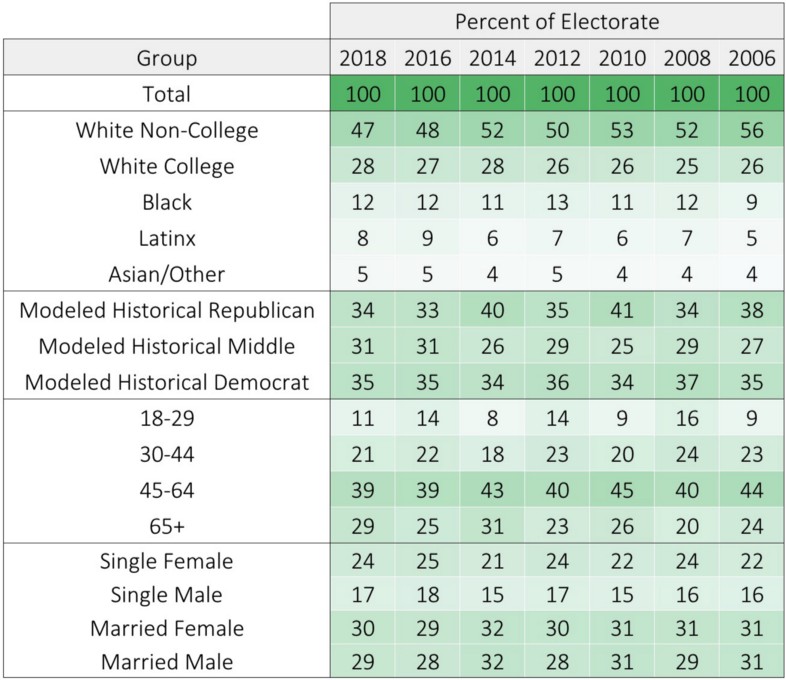
2018 saw a historic level of voter turnout, totaling 119 million votes, or 51% of the citizen voting-age population (CVAP). This is substantially higher than 2014 (83 million, 37% turnout), 2010 (90 million, 42% turnout), the most number of votes in any midterm ever, and the highest turnout rate since 1914.
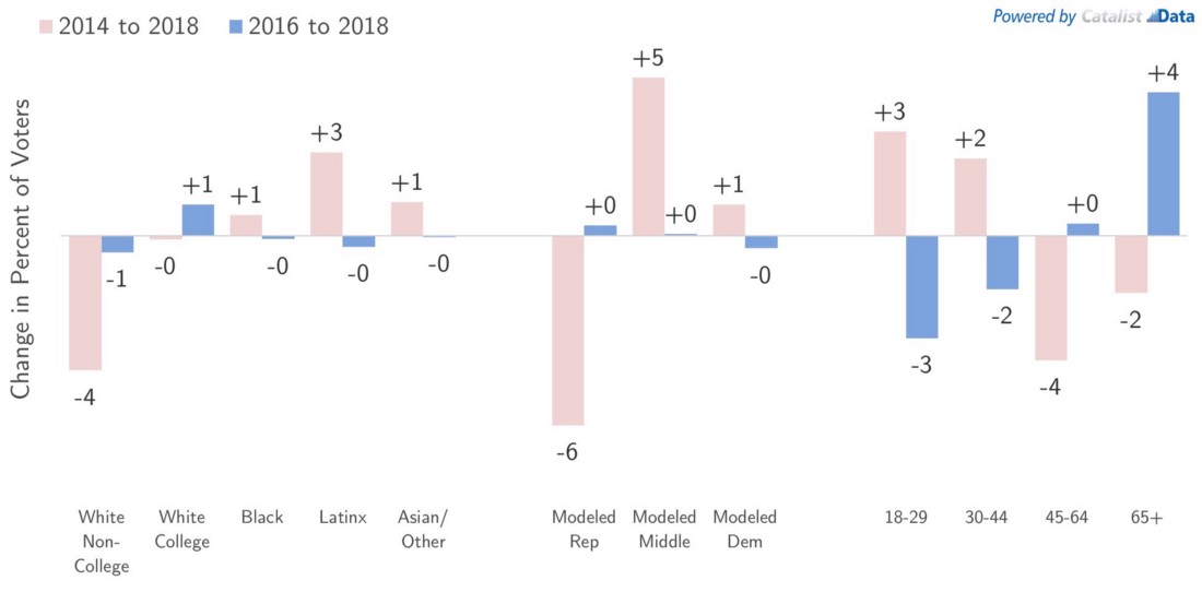
The demographic implications of the turnout increase was an electorate that looked more like a Presidential electorate, rather than a midterm. The graphs above compare the 2018 electorate to 2014 and 2016, across four sets of groups.
Compared to 2014, the 2018 electorate had more voters of color, especially Latinx voters who went from 6% of 2014 voters to 8% in 2018 (rounding to +3%). White college voters remained steady, while the big decline came from white non-college voters, who dropped from 52% in 2014 to 47% in 2018 (-4%). On race and education, the electorate was almost identical to 2016.
For a variety of reasons, it is difficult to examine voter file data by party identification directly, so the modeled partisanship data shown here can be thought of as a combination of party registration, precinct results, and other indicators of partisan leanings over the past decade. By this measure, again we can see big changes compared to 2014, and stability compared to 2016. 2014 was a very Republican electorate (40% of 2014 voters, compared to 34% modeled Democratic voters), and 2016/2018 were essentially the same as one another and relatively balanced by party (33–34% Republican, 34–35% Democratic).
Although 2018 resembled 2016 on the key traits of race, education, and partisanship, it did not quite resemble a Presidential electorate in terms of its age distribution. Midterm electorates are generally older than Presidential electorates, which garner much more attention and higher turnout rates. 2018 (11% 18–29 year olds) fell in between 2014 (8%) and 2016 (14%). We see a similar story on marital status, where there were more single voters in 2018 than 2014, but not quite to 2016 levels — undoubtedly this is related to age.
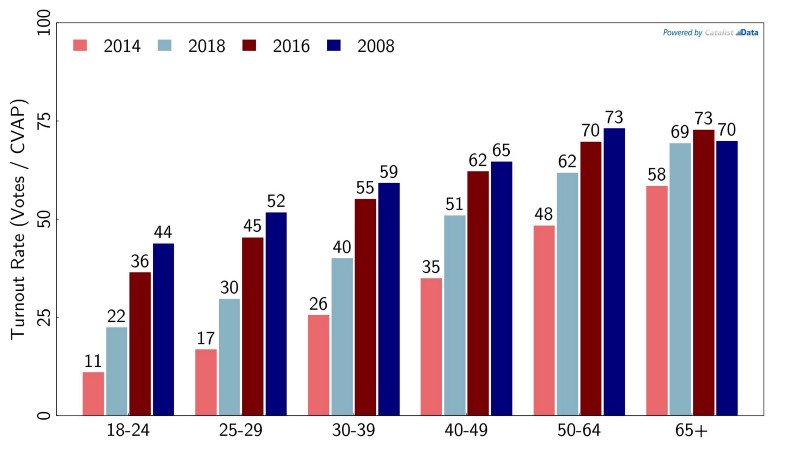
Another way to look at the data is looking at differential turnout rates, i.e., what percent of the citizen voting-age population (CVAP) actually voted? The data is broken out by age below. Generally speaking, people tend to vote more regularly as they get older, across all types of elections. 2018 was no exception, with 69% of citizens over the age of 65 voting, compared to 22% among 18–24 year olds. But this observation does nothing to diminish the huge amount of growth in turnout among young voters. Only 11% of 18–24 year olds voted in 2014. In other words, the youth turnout rate doubled compared to the last midterm.
The graph below also shows 2016 and a recent high water mark in 2008. The turnout rate in those Presidential years was higher than 2018 overall; what becomes clear looking at the data is that this was largely driven by higher youth turnout. In 2008, 2016, and 2018, the turnout rate of 65+ voters hovered around 70%, while the turnout rate among the youngest voters varied a great deal. Voter turnout in 2020 is likely to be quite high (more on this later); if that is the case, young voters certainly appear to have the most room to grow.
Turnout rates by age, across selected recent elections.
Vote Choice
The major turnout surge in 2018 was only part of the story. Democrats saw gains across many different areas of the country, due to both turnout and changing vote choice, i.e., people switching from voting for Donald Trump in 2016 to voting for Democrats in 2018. We will examine turnout versus vote choice more explicitly later on, but first this section lays out baseline data for how different groups voted in recent elections.
Overall, Democrats in the House gained about 5 points in margin compared to the 2016 Presidential election, going from +2% in the 2016 popular vote to +7% in the national Congressional vote in 2018, after projecting uncontested races. There were some big differences in how these gains were distributed, across demographic/political groups and across geographies.
Democrats gained 5 points in margin nationally, but gains were uneven across demographic groups.
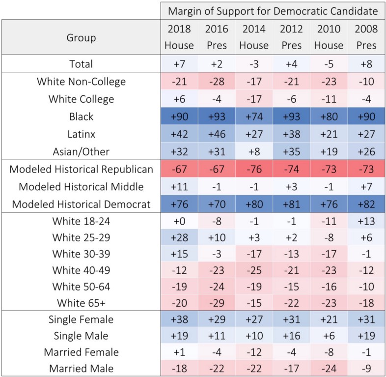
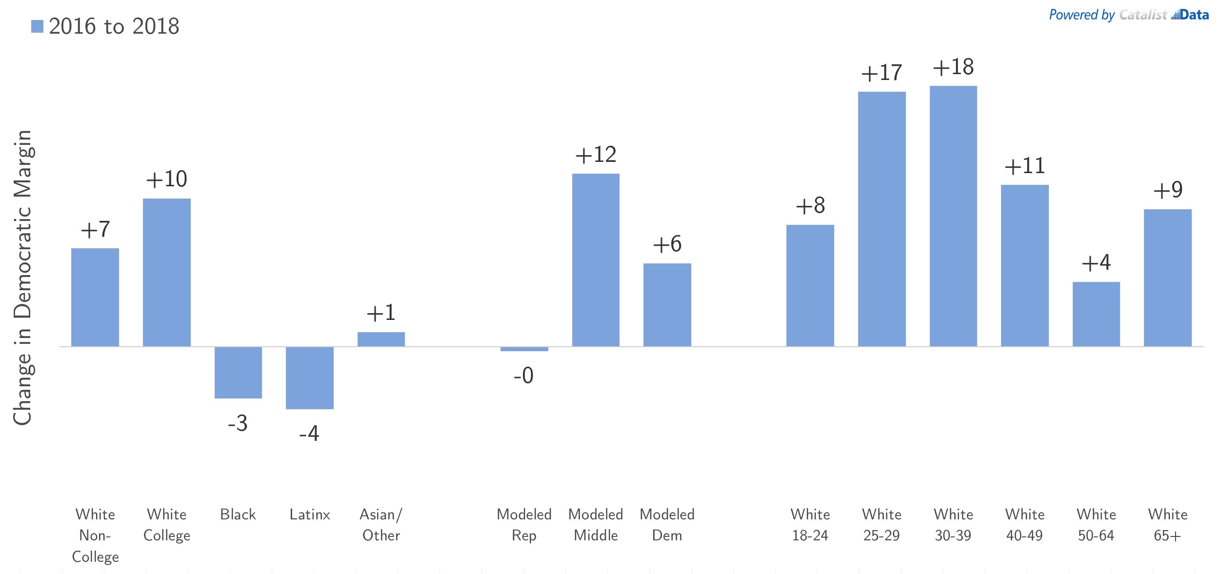
Democrats saw big gains among white college voters, who went from slightly Republican in 2016 (-4%) to slightly Democratic in 2018 (+6%), a 10-point gain. Though white non-college voters have been trending Republican in recent years, particularly in 2016 when Democrats lost them by 28 points, they bounced back in 2018, where Democrats lost them by only 21 points. Democrats had relatively small estimated losses among African American and Latinx voters compared to 2016, but Democrats are still winning these groups by wide margins, and these groups had big Democratic gains compared to 2014 and 2010.
Looking at changing vote choice by modeled partisanship, we see the biggest gains from people modeled to be in “the middle.” As mentioned earlier, this group isn’t exactly the same thing as “Independent” or “swing” voters, but it is notable that Democrats won this group by 11 points in 2018, compared to being essentially tied between 2010 and 2016. The partisan groups are also interesting: the modeled categorizations here reflect what we’ve seen over the past decade or so, which puts a lot of weight on the Obama years. From 2008 to 2014, modeled Democrats and Republicans were very far apart, with a roughly +80-point Democratic margin among the Democratic group, and roughly +75 Republican among the Republican group. In 2016, political dynamics shifted, with a substantial number of Obama-Trump voters and Romney-Clinton voters. Both groups moved towards the middle, with “historical” Democrats voting slightly more Republican (about a 10 point shift), and “historical” Republicans voting slightly more Democratic (again by about 10 points). In 2018, some of the Democrats appear to have shifted back, going from +70 in 2016 to +76 in 2018, while the historical Republican margin remains the same. Given the imprecise nature of these groupings — they are based on a conglomeration of historical data — it is difficult to read too much into these trends. But they do suggest that some Obama-Trump voters did bounce back to Democrats in 2018.
When looking at vote choice by age, here we focus on the changes among white voters, due to the small changes in communities of color overall. The biggest changes were among “elder millennial” white voters, i.e., the 25–29 and 30–39 age groups who swung towards Democrats by 17–18 points. It is important to realize that the youngest white voters, aged 18–24, are less Democratic overall and had a smaller swing in 2018. By our estimates, Trump actually won this group by 8 points in 2016, and they were tied in 2018. Young voters as a whole are becoming more progressive and Democratic, in part because they are more ethnically diverse than other generations, but the voting preferences of young white voters is an important data point to keep an eye on moving forward.3We have worked on other research projects showing that the lifelong preferences of white voters are most strongly formed around the ages of 14–24, and informed by the popularity of the President during those formative years. The youngest white voters were simply not alive or paying much attention during the popular Democratic years of Bill Clinton, and the unpopular years of George W Bush. For more information, see here, here, and here.
Geography
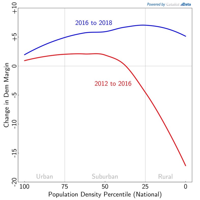
Democratic gains were also geographically uneven across the country. In our view, these trends have been fairly widely mischaracterized.4This section is built on joint research that we conducted with People’s Action. Most people are probably familiar with the large-scale rural/suburban/urban story from 2016. Despite rural areas being more Republican even before this election, the change from 2012 to 2016 was dramatic: rural areas became even more Republican, suburban areas became more Democratic, and urban areas largely stayed the same, with small shifts towards Democrats:
Rural America shifted towards Republicans from 2012 to 2016.
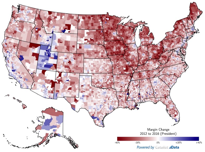
Media reports have largely described 2018 as a continuation of this trend, focusing mainly on suburbs that flipped Congressional seats from Republican to Democratic, and saying that the urban/rural divide is bigger than ever. But this misses a critical part of the story: rural areas largely moved in a Democratic direction, often by even larger margins than the suburbs.5The maps show census tracts, using precinct-level election results where available, and data projected from individual-level voter registration data and district-level Congressional results elsewhere.
Despite media narratives to the contrary, rural American bounced back towards Democrats in 2018.
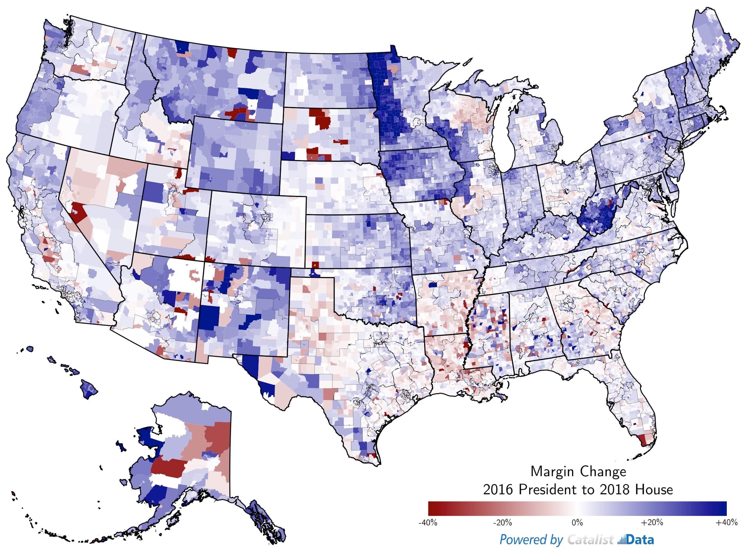
The trend lines below show the year-to-year trends more explicitly. We categorize every census tract in the country as urban, suburban, or rural, based on population density. The most urban (dense) tracts are shown on the left, and the most rural tracts are shown on the right. From 2012–2016, rural areas became more Republican by about 11 points in margin. From 2016 to 2018, there was a major bounce-back, with the same areas becoming about 6 points more Democratic. Suburban areas trended Democratic in both elections, and urban areas moved towards Democrats by a relatively small amount.
The urban/suburban/rural trends, shown more explicitly.
A state-by-state analysis is outside the scope of this post, but it is important to realize that this trend was not consistent across the entire country. It was strong across the Midwest, but not always seen in the South. The data above shows changes from 2016 President to 2018 Congressional, but the trend was also seen in many different statewide elections, and can be seen using publicly available data, as was done here. Some of this was undoubtedly influenced by incumbency and other local factors that may not necessarily translate in a nationalized election like the 2020 Presidential race. When doing a national analysis like this, by necessity we are capturing national trends, while averaging over some important state-by-state distinctions. Suffice it to say, we think it is important to understand what drove these changes, in order to understand potential changes in 2020 Democratic and Republican coalitions.
Presidential Dropoff and Midterm Surge
Traditional election analysis, including the earlier sections of this post, deal with fairly standard sets of group-level aggregate data. Who did Latinx voters support (as a group), and how did Precinct X vote (as a group)? Using individual-level voter registration data, collected over time, opens up the possibility for different groups that are defined by their recorded behavior.
In this section, we analyze election results based on voter turnout over time. How did the turnout and margin changes manifest themselves in terms of election turnover? Thinking about the 2016 and 2018 elections, there are four types of voters:6These groups are not measured perfectly, even on a national voter database that is maintained consistently over time. The problem is that matching, also known as record linkage, is an imperfect process that has false positives and false negatives. In other words, when somebody moves or changes their registration information in other ways, a statistical system has to link the changes to earlier records in the database. This has uncertainty and errors associated with it, so somebody who we think is a “new voter” may in fact have been an existing voter and our systems can’t recognize that they are in fact the same person. See here for more discussion and details of one open-source matching system. The implications of this matching uncertainty on various statistics of interest are important and beyond the scope of this post. For this section, the important point is that the same systems are used over time, so comparisons over time should not be biased. The unit of analysis is a person/state combination.
- People who voted both times
- People who voted neither time
- People who voted in 2016 but not 2018 (Presidential dropoff voters)
- People who didn’t vote in 2016 but did vote in 2018 (midterm surge voters)
For now let’s examine groups 3 and 4, i.e., people who voted in only one of the two elections.
Higher turnout was associated with relatively low voter dropoff from 2016, and a large number of new voters.
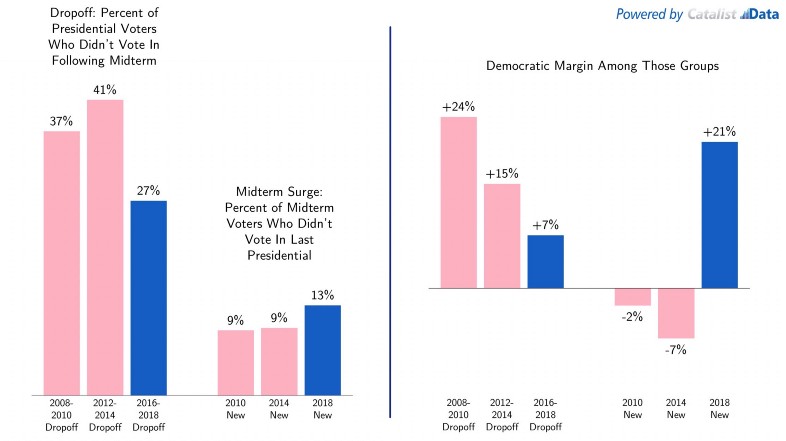
High turnout in 2018 can be seen in the voting behavior of these groups in various ways. 27% of 2016 voters dropped off, substantially lower than the roughly 40% dropoff in the previous two midterms. There was also a surge of new midterm voters: 13% of 2018 voters were new (didn’t vote in 2016), compared to only 9% in the previous two midterms.
These trends reflected not only a high level of voter enthusiasm writ large, but a strong Democratic surge of enthusiasm. The 2018 surge voters supported Democrats by a +21% margin, while Republicans won surge voters in both 2014 (by 7 points) and 2010 (by 2 points). The “dropoff loss” was smaller for Democrats in 2018, too. Dropoff voters were a smaller group this time than in the past, and the voters who did drop off were less likely to vote for Democrats (+7% for 2016 Dropoff voters, compared to +15% and +24% in the previous midterms). These statistics reflect the impact that a motivated Democratic midterm electorate had in 2018.
Putting It Together: Different Electorate and Different Vote Choice
[UPDATE: In 2020, Catalist refrained from publishing a decomposition of the electorate similar to the one it provided in 2018. An FAQ in the What Happened 2020 analysis explains this reasoning:
In our analysis of the 2018 election, we tried to explicitly decompose the impact of differentia turnout versus changing vote choice to explain changing election results from one year to the next. We decided against publishing a similar analysis in this report, for two reasons:
- Our report in 2018 repeatedly and strongly emphasized that both turnout and vote choice played an important role in Democrats’ victory: (a) the spike in Democratic turnout compared to past midterms made the electorate demographically similar to 2016 which was incredibly important, and (b) changing vote choice among 2016 voters pushed things even more in the Democratic direction. Point (a) was lost to many, because our “decomposition” calculation used 2016 as a baseline, and was explicitly comparing that 2016 (Presidential) election to the 2018 (midtem election).
- In retrospect, we consider the “percent impact” number we developed to be a noisy indicator of the impact of persuasion vs. mobilization. The number divides one small number (the impact of turnout or changing vote choice, based on survey-driven estimates) over another small number (the change from one election to the next). From 2016 to 2020, we would be trying to decompose a 2-point margin change (the denominator), using a numerator with too much uncertainty around it. In other words, small changes in our estimates could lead to large-looking changes in the “percent impact” numbers.
The original 2018 decomposition analysis below is preserved for transparency.]
Because of these two factors, we think it is more prudent to lay out the various factors in more descriptive terms, as we’ve done in this report. For more information on why we consider some of these numbers to have substantial uncertainty around them, see details in the New Generation of Voters section. Overall, we know that people’s enthusiasm to vote and their propensity to cross over to vote for a different party or candidate than they have previously can be closely related. We’re interested in developing more sophisticated and rigorous methods for decomposing this effect, and are interested in working with researchers who have interest in studying this more going forward.
As different years bring different election results, many people have debated the extent to which these changes are driven by (a) differential turnout or (b) changing vote choice.
Those who believe turnout is the driver point to various pieces of evidence. Rates of geographic ticket splitting have declined over time as elections have become more nationalized. Self-reported consistency between party identification and vote choice is incredibly high. In the increasingly nasty discourse between people who are involved in day-to-day national politics, it is hard to imagine there are many swing voters left. And all you need to do, this argument goes, is look at the different demographics of people who voted in Presidential vs. midterm years to see that when young and ethnically diverse voters go to the polls, Democrats win.
Those who think changing vote choice is important point to different sets of evidence. Geographic ticket splitting has declined, but not down to zero, and rates of ticket splitting only reflect levels of geographic consistency anyway. Surveys do show consistency, but again not 100% consistency, and survey respondents are more likely to be heavily interested in politics, more ideologically consistent, and less likely to swing back and forth. It’s true that political elites and highly engaged partisans — whether that means legislators, activists, partisan cable viewers, or others — are increasingly polarized on ideological lines, but there is little evidence that this extends to the general public writ large. The President-to-midterm swings of recent years were only partly driven by demographic turnout trends, and also reflect a generalized penalty that incumbent Presidents see in midterm elections, which predate the vast demographic differences we see between Democrats and Republicans today.
How to sort through it all?
As mentioned earlier, our voter registration database keeps track of who voted in different elections, and our statistical models used in this analysis provide estimates of how different people voted in the different elections. In this section, we’ll combine all of those data sources to decompose election-to-election change into various independent components, to try to point towards an answer. Details about our calculations can be found in the Appendix.
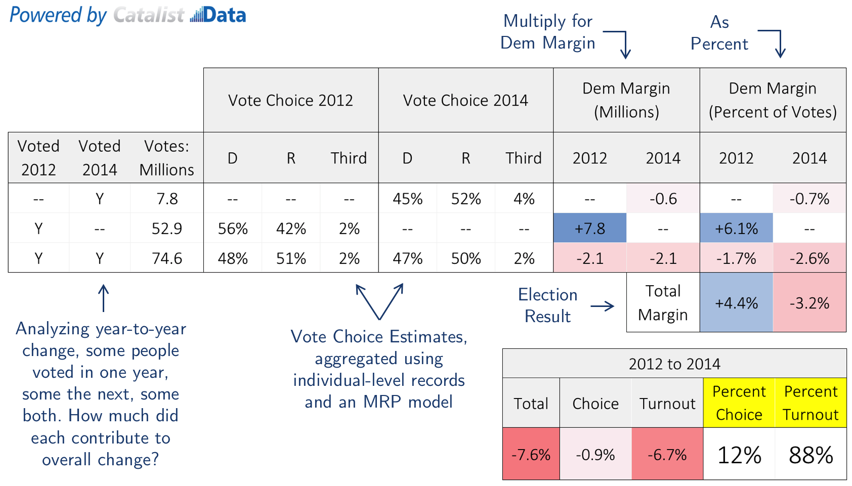
Let’s build intuition about our approach by looking at a fairly simple case: the change between 2012 and 2014, shown below. Barack Obama won the Presidency in 2012 by 4 points, and the 2014 midterm saw a large swing towards Republicans, when they won the House by about 3 points, totaling a margin shift of 7.6 points.7After projecting uncontested races Conceptually, this 7.6% swing can be decomposed into 3 parts:
- President to midterm dropoff voters: how much loss was due to Democrats who voted in 2012 but dropped off and didn’t vote in 2014?
- New, midterm surge voters: how many new votes did Republicans gain due to new voters who showed up in 2014 but not in 2012?
- Changing vote choice among people who voted both times: did this happen, and to what extent?
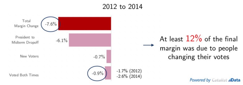
By examining the size and changing vote margins among these different sets of voters, we can produce reasonable estimates for all of these numbers. The data from 2012 to 2014 is shown above. The total margin change was -7.6 points. President to midterm dropoff voters accounted for -6.1 points: this was a large group, 52.9 million voters, who strongly supported Obama (56% to 42%) and stayed home in 2014. New 2014 voters supported Republicans (52% to 45%) but were only 7.8 million voters, multiplying out to -0.7% margin. The remaining change came from 74.6 million people who voted both times, and barely shifted their candidate preferences, from 51–48% Republican in 2012 to 50–47% in 2014. Again multiplying this out leads to -0.9% in margin.
Adding these three numbers up fully explains the -7.6% margin change. Under this framework, -6.8% (88%) came from turnout (mostly 2012 dropoff voters), and -0.9% (12%) came from changing vote choice. For a variety of reasons, it is best to think about this 12% number as a lower bound for the importance of changing vote choice.8In this analysis, we intentionally assign as much weight as possible to turnout, because we think it is valuable to show that vote choice still matters even when computed as a lower bound. Arguably true changes in vote choice are captured here as part of the “turnout” number in a variety of ways: (a) people who dropped off from 2012 to 2014 may have also switched towards Republicans had they decided to vote; (b) new 2014 voters may have been motivated to vote this time because they supported Republicans more strongly; © mismatches who actually voted both times but appear to be both dropoff and new voters (as different records) fall under the “turnout” column in this analysis; (d) relatedly, people who moved from one state to another between elections are counted as “new voters” because the Catalist database is keyed on person/state as the unique identifier. Some people also argue that vote choice and turnout are always jointly determined, so in some sense this division is nonsensical; even so, it is a practical question that informs many campaign decisions, so we continue to analyze it here. We should also emphasize that there is uncertainty around this number based on a variety of modeling choices. But in our view, this is still a useful framework for analyzing election change, and the conclusion for this set of elections is clear — the 2012 to 2014 change was likely mostly due to differential turnout.
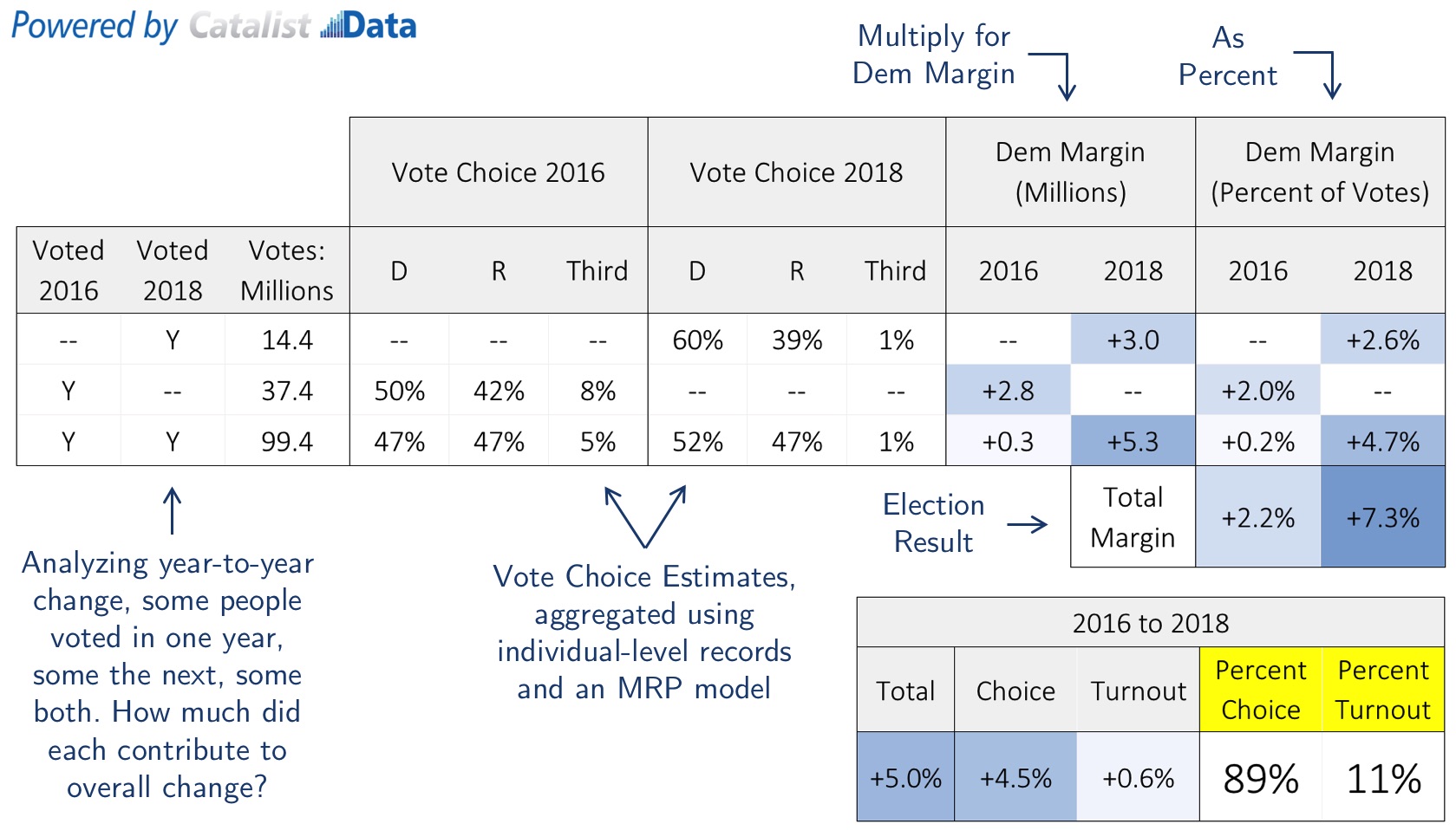
Decomposing the change in total outcome (margin) from 2016 to 2018. Turnout was important in essentially breaking even with 2016, but Democratic gains were also largely driven by voters who voted for Trump in 2016 and voted Democratic in 2018.
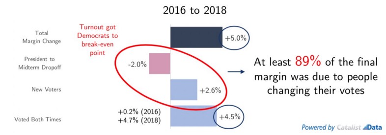
What about the change from 2016 to 2018? The same calculations from earlier are shown in the graph above and tell a different story. Overall, Democrats had a +5.0% gain compared to the 2016 Presidential. The impact of dropoff voters was only -2.0% this time, because the number of dropoff voters was smaller (37.4 million people) and they were less strongly supportive of Clinton (50% to 42%). There were 14.4 million new 2018 voters, who supported Democrats 60% to 39%, multiplying out to a +2.6% margin. The remaining change came from 99.4 million people who voted both times, and went from being tied in 2016 to 52% to 47% Democratic in 2018, multiplying out to +4.5%.
In other words, two things happened between 2016 and 2018. First, there was a massive turnout boost that favored Democrats, at least compared to past midterms. The “turnout penalty” in 2014 cost Democrats about 7 points in margin. This time turnout essentially broke even with 2016 — this was a major piece of the Democratic victory. But if turnout was the only factor, then Democrats would not have seen nearly the gains that they ended up seeing. Changing vote choice accounted for a +4.5% margin change, out of the +5.0% margin change that was seen overall — a big piece of Democratic victory was due to 2016 Trump voters turning around and voting for Democrats in 2018.9Some of the vote switching was to/from third party, but we repeated the analysis in two ways: removing third party voters and allocating their votes. There are no changes to the conclusions in either case.
Clearly, turnout vs. vote choice dynamics differ over time, as shown in the two examples above. These dynamics also differ across elections, inside a single time period — i.e., statewide, Congressional, and other races.
Decomposing the change in total outcome (margin) from 2016 to 2018, for different statewide and Congressional elections. Dynamics changed from place to place, but overall, many of the places that saw big Democratic gains had a large component of vote choice, i.e., Trump to 2018 Democratic voters. Geographies are sized by how competitive they were in 2018.10Congressional races are sized smaller than statewide races to keep things fairly visible.
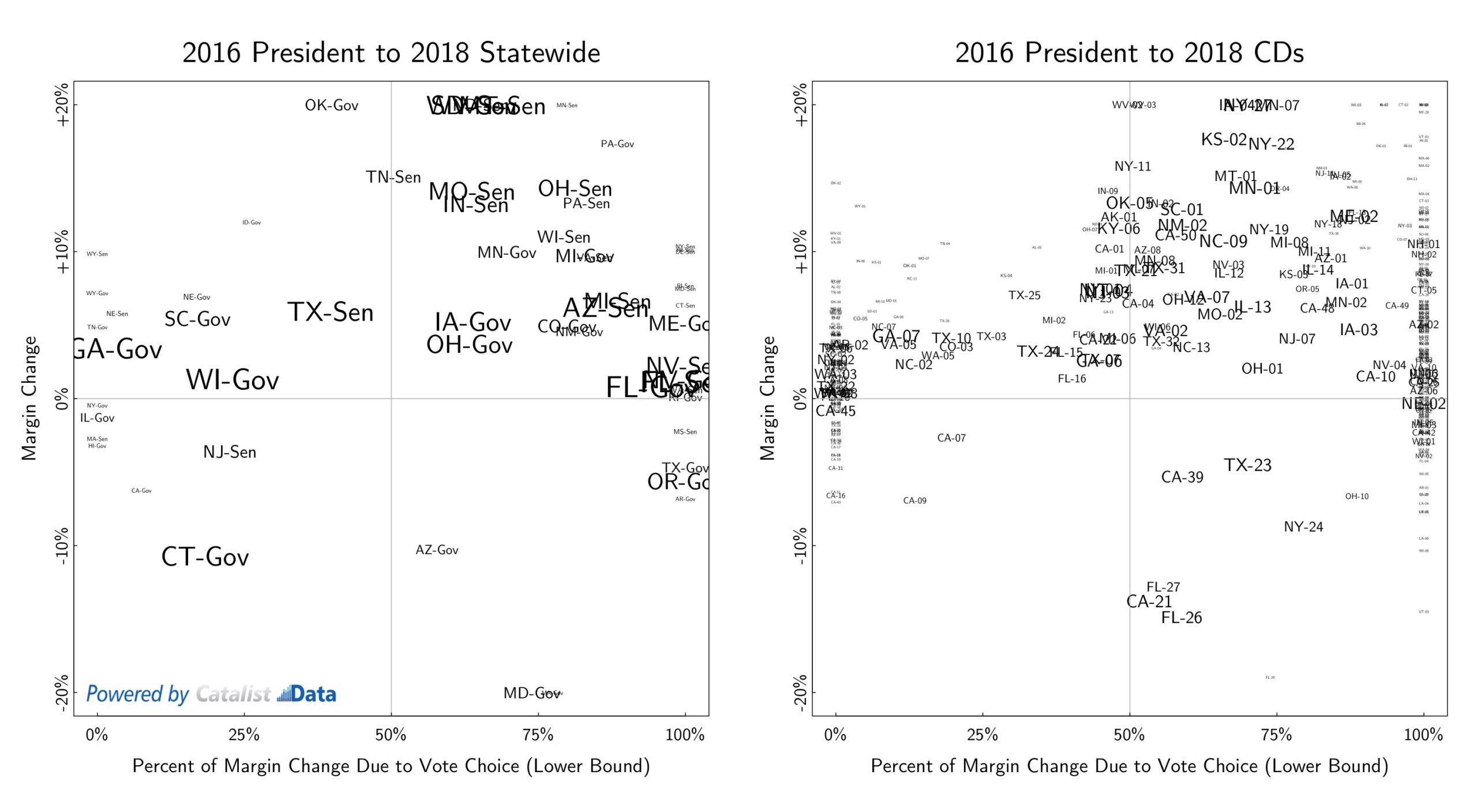
The graphs above show these calculations for various statewide and Congressional races,11Statewide elections where we had more than 150 survey responses are shown. All CDs are shown, except those in Pennsylvania which had different district lines in 2016. analyzing the change from the 2016 Presidential to 2018, and emphasizing close elections with larger text. In each graph, the margin change is shown on the y-axis: higher up means 2018 was better for Democrats than 2016. The percent of the margin change due to vote choice — i.e., the statistic calculated nationally above — is shown on the x-axis.12The x-axis is bounded at 0% and 100%. Elections that fall outside of these bounds are places where turnout and vote choice went in opposite directions. For example, the Nevada Governor’s race had a small Democratic margin gain overall, but the turnout was slightly worse for Democrats than in 2016; the vote choice component therefore accounts for > 100% of the total gain, and is shown as 100% in the graph. Areas that are further to the right in the graph are places where changes in vote choice were a big part of the Democratic victory; in other words, places where there were a lot of Trump-to-Democrat switchers.
These graphs reveal a lot of information. There are statewide races where there were large, double digit Democratic margin gains — sometimes lining up with incumbency, like Sherrod Brown in Ohio, Amy Klobuchar in Minnesota, or Joe Manchin in West Virginia — in all of these cases, a large portion of the change came from vote choice. Some of these races were blowouts, but some weren’t — see Kyrsten Sinema in the Arizona Senate race, for example. There were also some elections with Democratic gains that were mostly due to turnout — Stacey Abrams in Georgia, Tony Evers in Wisconsin, and Beto O’Rourke in Texas. Looking at all of the elections together, though, does show that vote choice was a big component of elections were Democrats had major swings in their favor.
This is even clearer looking at the Congressional elections. Most of the competitive races with big Democratic margin gains had a large vote choice shift component to them.
On some level, perhaps these results are unsurprising. Double digit differences in margin from one election to the next are fairly rare, and it is hard to imagine that turnout alone can produce those kinds of differences. Some of these results are driven by incumbency and specific election circumstances that may not be generalizable in more competitive environments. And none of this is to say that turnout differences are unimportant, especially in close elections — again, it is worth repeating that the massive turnout boost in 2018 got Democrats to a roughly even point compared to 2016, which was incredibly important as well. But in our view, this data does emphasize the importance of vote choice in Democratic victories in 2018.
It is again worth emphasizing that these analyses show our best estimates of what happened, not why it happened. Changing turnout levels among partisans and changing minds in the middle both appear to matter in terms of recent elections. For Democrats, it would be ideal to find strategies that allow progressives to avoid what Democratic Party Chairman Ron Brown called “the false choice” between mobilization and persuasion, when clearly both are important.
Looking Ahead to 2020
This analysis has many implications for the 2020 Presidential election, frankly too many to be covered in detail in this post. We’ll briefly focus on three topline takeaways here.
Expect a historic number of votes in 2020.
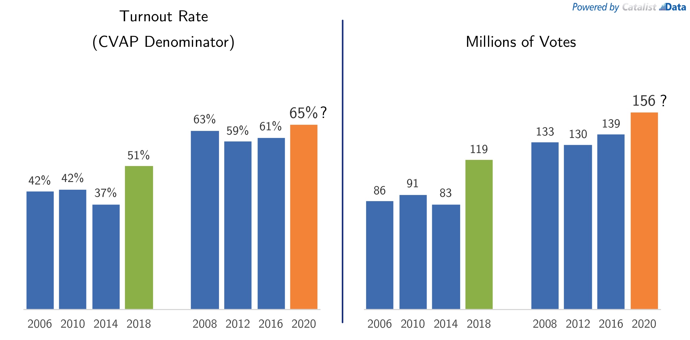
First, on turnout: there are few signs that the overwhelming enthusiasm of 2018 is slowing down. 2018 turnout reached 51% of the citizen voting-age population, 14 points higher than 2014. 2016 turnout was 61%. If enthusiasm continues, how high can it get? It is unreasonable to expect a 14 point boost up to 75%, but is 70% reasonable? Here we show that turnout could easily reach 155 to 160 million votes, due to a boost in the turnout rate and the steadily increasing population size, which could reach around 240 million people in 2020.
Decomposing the change in total outcome (margin), for the last two Presidential swings. States are sized by how competitive they were in the latter election.
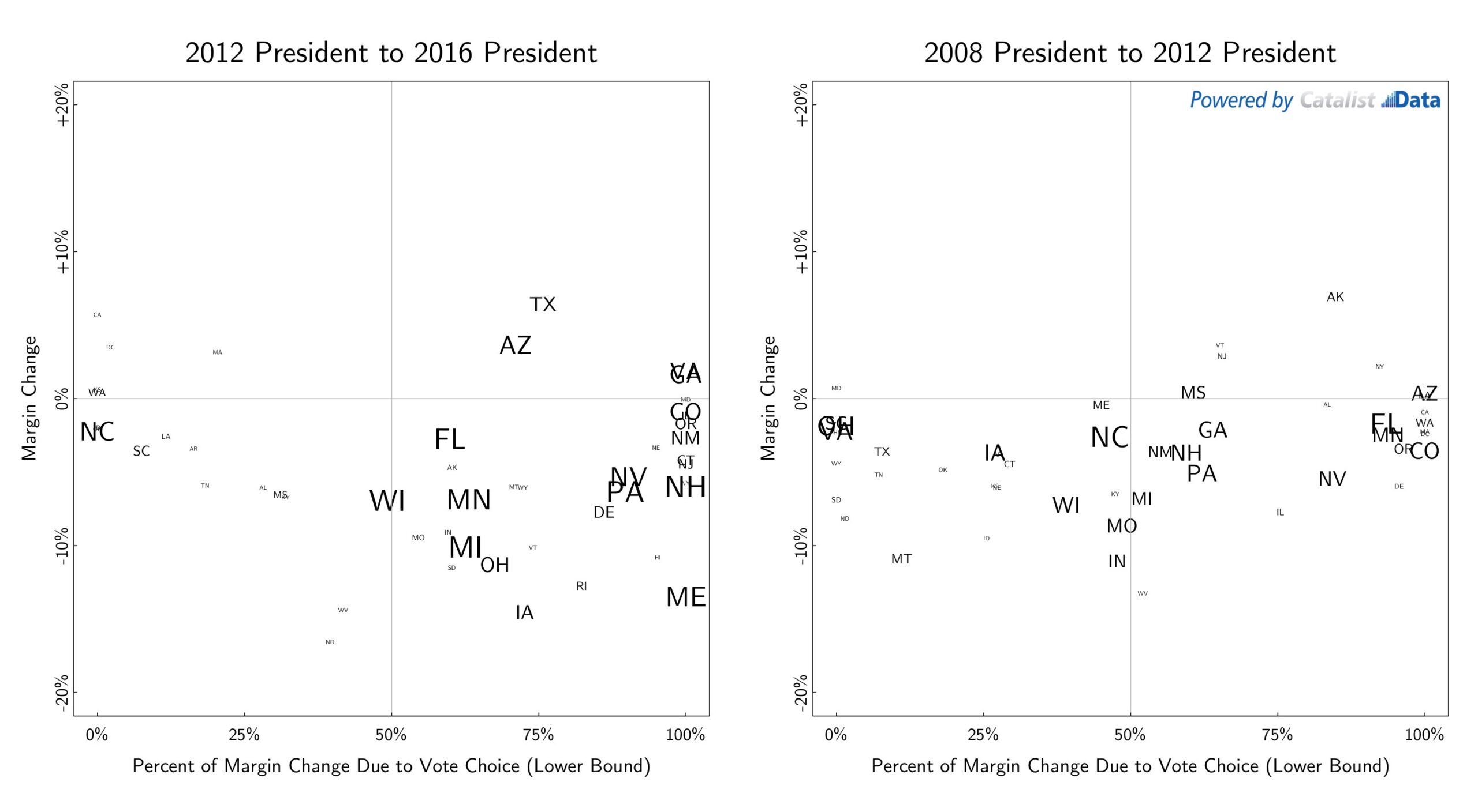
Second, on vote choice: earlier we emphasized the importance of vote choice in analyzing 2016 to 2018 changes. The same data can be shown comparing the last two sets of Presidential elections, as seen above. Looking at the 2012 to 2016 change, Donald Trump won major victories in important swing states, with sometimes different dynamics across states — turnout was important in North Carolina, vote choice was important in Pennsylvania, and so on. But once again, we see states with big margin changes cluster on the right-hand side of the graph. The distribution of states is wider in the 2008 to 2012 change, perhaps because of the relative stability in voting preferences across the two elections. Regardless, our view of what this data shows is — turnout is important, but it would be unwise to assume that people’s voting preferences are cast in stone.
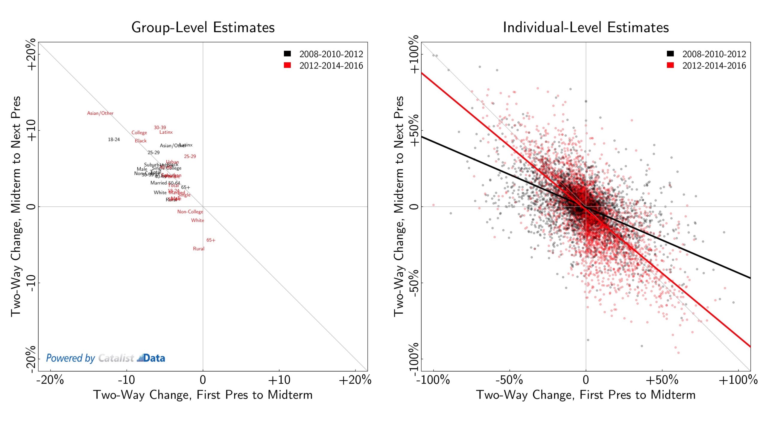
Another way of looking at this is shown below. Democrats made big gains between 2016 and 2018. How likely is it that these gains will persist through 2020? The graphs below are a reminder that there were also big swings in 2010 and 2014, and those swings bounced back in a big way 2 years later. 2008 to 2010 went from a historic Democratic victory to a Republican “shellacking,” only to bounce back to an Obama victory in 2012. The graphs below show that wasn’t only true overall, but also among key voting groups (left), and as estimated using our individual-level estimates (right); the individual-level graph shows statistical estimates for 10,000 randomly selected people on the voter database, who voted in the three relevant elections. The same was true for the 2012–2014–2016 cycle. While 2018 was an important victory for Democrats, the gains that were made could very well bounce back to Donald Trump in 2020.
Republican gains in the past two midterms swung back towards Democrats in the following Presidential election. The diagonal line shows 100% “bounce-back” from one election to the next. In both cases (key groups on the left, a random sample of 10,000 individual-level estimates on the right), there was a substantial swing back.
Appendix: Notes on Statistical Methods
e published our preliminary estimates the week after the election, and since then have been collecting various new pieces of data to verify and update what we saw back then. Looking back on the preliminary data and analysis, we think that the estimates were very accurate in many cases and slightly off in some other cases. Substantively, our judgment is that the analysis holds up, with some important caveats.
First, on the composition of the electorate. We have now received individual-level vote history data for almost every state in the country.13This analysis includes vote history information for all states except Alabama, Kentucky, and New Hampshire. Our numbers on composition, or “share” of the electorate, were very accurate, with almost every group within 1 point of our preliminary data. The one exception is age — we underestimated the number of young voters (18–29), which we originally had at 9% but were actually 11% of 2018 voters; conversely, we overestimated the number of older voters (65+), which were originally estimated at 31% but were actually 29% of the electorate.
Next, on Democratic vs. Republican voting margins. Here our estimates did change a little bit more, for a number of reasons. (1) The national Democratic margin of victory rose as more results were counted after we published our original data. (2) Collecting and incorporating more precinct data did change some results, accounting for voting trends that our models didn’t originally estimate properly. (3) As we continued to scrutinize our results, we noticed minor improvements that could be made to our vote choice models, and chose to make those improvements for the updated data. (4) Because of the changes in composition numbers mentioned above, margins within those groups shifted. In other words, our preliminary estimates for vote choice among young people were slightly too pro-Democratic. At the end of the day, the data has to add up to the final overall outcome; when it became clear that there were more young people in the 2018 electorate than our model had originally accounted for, their vote margins went down as a result.
In this project, we’ve tried to be transparent about our processes and the fact that some of the data we showed early was preliminary. We realize that publishing “revised estimates” is not standard practice in political data analysis. But from our point of view, sticking to numbers that were published quickly after the election is a bad decision. Producing rough numbers quickly is important, but new data comes in that provides a better understanding of what happened. Applying this logic to more typical survey analysis — individual responses inside of a survey don’t change as time moves on, but a pollster might consider weighting the poll differently once better turnout data becomes available. This is not common practice historically, which makes looking back at surveys easier, but also means that data is less accurate.
Changes in our results also reflect some of the inherent uncertainty in these estimates. We collect a lot of data and build a lot of models, but at the end of the day we end up with statistical estimates that have uncertainty around them.
As we continue to move this project forward, we are going to make a number of changes and improvements to our processes. We are continuing to collect and match precinct data to our voter file — precinct data is not available nationally, so it must be collected and matched state-by-state over time. More broadly, putting this dataset together requires many technical processes under the hood. As always, these processes aren’t perfect and are constantly being improved, which may have downstream effects on the estimates shown here.
Appendix: Decomposing Changes in Turnout and Vote Choice
The calculations described earlier to decompose the margin change are shown below. One complication is third party voting, which was higher in 2016 than other years. Different versions of these calculations were done, by excluding third party voters or projecting their two-party vote share. Results remained the same under these different sets of calculations.
Calculations for margin decomposition, 2012 to 2014 (top) and 2016 to 2018 (bottom).
