Please note: The analysis below is based on an initial estimate of the 2018 electorate. Catalist released an updated analysis of the 2018 electorate in May 2019.
December 13, 2018
Author: Jonathan Robinson, Lead Research Scientist
The race for Governor in Georgia between Democrat and former House Minority Leader Stacey Abrams and Republican (now former, then current) Secretary of State Brian Kemp was one of the closest statewide electoral contests in recent history. In 2016, Hillary Clinton narrowly lost Georgia by just 5 points, compared to Barack Obama’s 8 point defeat in 2012, tentatively moving Georgia into the battleground in a potential Democratic wave election.
In 2018, Abrams lost Georgia by only 1 point, outperforming Hillary Clinton by almost 4 percentage points, but falling just short of victory. How did the Abrams campaign get so close to winning a state that just a few years ago observers had thought was lost to Democrats for the foreseeable future? In this analysis, we’ll cover important trends in turnout and support that contributed to Abrams’s strong performance, namely:
- Converting groups of voters to support her who had previously voted for third-party candidates in 2016
- Mobilizing a growing Democratic-leaning coalition of young people, voters of color, and suburban voters to match or come close to Presidential levels of voter turnout in a midterm year
- Growing her support among groups that swung towards Democrats in 2016: women voters, and white voters who live the areas surrounding Atlanta.
Georgia is also one of the first states to update its voter file to report vote history, and as a result, there have been some preliminary reports on topline levels of voter turnout, which we compare to our numbers at the end of the post.1Catalist is currently in the process of acquiring the Georgia state vote history and voter registration file.
Young voters surge
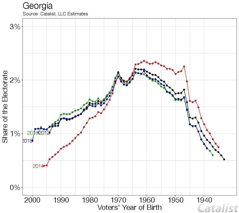
As was also evident in our post on national trends, Georgia saw a surge in participation among young voters. The surge was even higher than what we saw nationally, with voters 18–29 increasing their share of the electorate by 5 points from 2014 to 2018. We can see those trends year-by-year in the graph below: the age distribution of voters in 2018 looks much closer to recent Presidential years than 2014, which was a much older electorate.
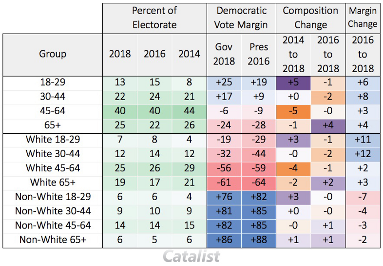
18–29-year-old voters also increased their margin for Stacey Abrams over Hillary Clinton by 6 percentage points. Where did that margin increase come from? We estimate that third-party candidates received 11 percent of the vote among 18–29-year-olds in Georgia in 2016 and that Republicans received 35 percent of the vote, with Democrats claiming the remaining 54 percent. Of the 11 percent of young voters that voted for third-party candidates in 2016, 8 percent supported Abrams in 2018, 2 percent supported Kemp, and 1 percent remained with the third-party candidate, meaning that young, formerly third-party voters broke towards Abrams by a whopping margin of over 2 to 1.
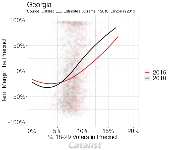
We can also see important political trends in the precinct level election results data. Precincts with many young voters are generally more supportive of Democrats, but the gap was larger in 2018 than 2016.
Important partisan trends in support and turnout
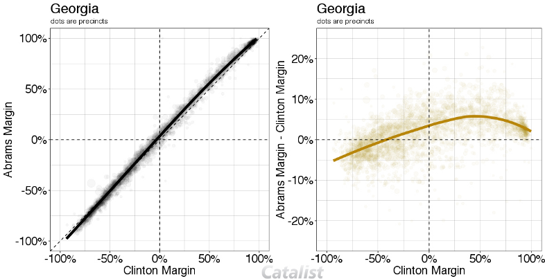
As my colleague Yair Ghitza has already noted elsewhere on national trends, there was a strong relationship between 2018 Abrams vote and 2016 Clinton vote at the precinct level. The trends were not fully consistent, though: both deeply Republican and deeply Democratic areas stayed consistent with their 2016 vote, and the vote swung the most towards Abrams in areas that performed moderately well for Clinton. On average, Abrams overperformed Hillary Clinton by 6 percentage points in areas where Clinton was at parity with Trump or better in 2016.2Precincts ranging from tied to around 50 percent in Clinton margin in 2016.
These trends translate to key political and demographic groups in interesting ways. Georgia doesn’t have party registration on the voter file, but we have models that identify people who are likely to have voted for Democrats or Republicans in the past. Abrams won voters who are harder to categorize, i.e., people who are more likely to be Independent voters, by 1 point, the first time since at least 2008 where a Democratic candidate won the group.3Among modeled Democrats, we saw a 7-point increase in support from 2016 to 2018 nationally, but no change in Georgia. This is likely due to technical issues, not necessarily political ones. Georgia does not have party registration on the voter file, so “modeled Democrats” are more likely to be African Americans in Georgia. They have supported Democrats consistently for years, so there is not as big a change from 2016 to 2018. In other words, this likely underestimates the change among people who would self-identify as Democrats in Georgia.
There are also interesting turnout trends here. Nationally, we estimate that modeled Republicans fell by about 5 points as a percent of voters compared to 2014, with people in the “middle” becoming a larger group. We saw the same trend to a larger degree in Georgia: modeled Republicans fell by a full 8 points, and the middle increased by 9 points. This is consistent with the Abrams campaign’s strategy of turning out new and less-traditional midterm voters, including young voters and People of Color, for the first time.

Deep trends in support and turnout by race
Turnout by race was much more in line with 2016 than past midterm electorates, dovetailing with evidence from youth turnout that shows a Georgia 2018 electorate that very much resembled a Presidential year electorate.
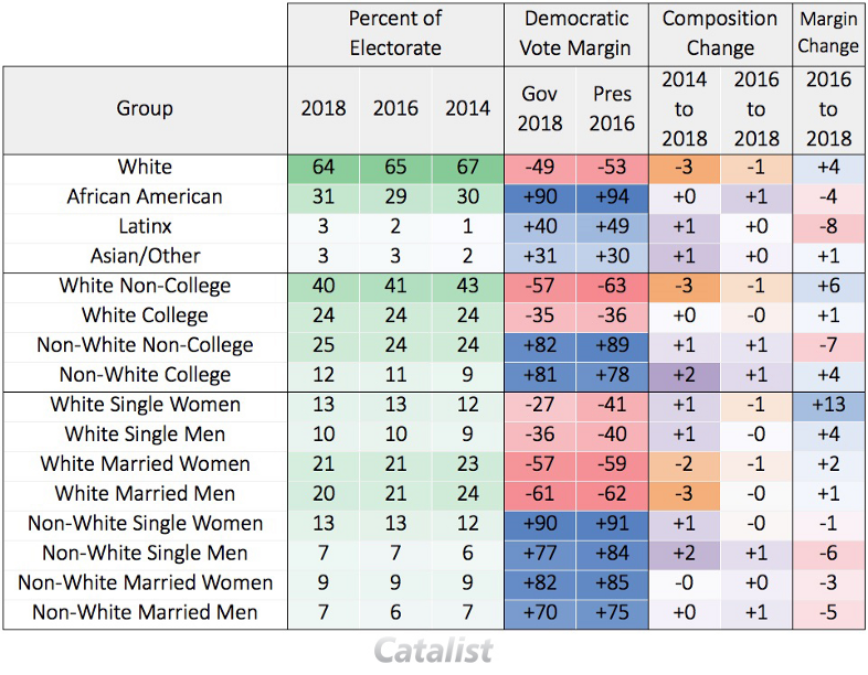
Comparing to 2014, turnout fell among married white voters in comparison to white unmarried voters, with married white men (a key Republican voting block) falling 3 percentage points, and young white voters increasing by 1 percentage point.
When examining race and education, we see an important trend for understanding the Georgia electorate. Vote share among white voters without a college degree fell by 3 points compared to 2014 (and were 1 point off their share in 2016), while white voters with a degree held their share stay stable. Voters of Color saw their share increase (African American vote share increased by 1 point compared to 2014 and 2 above 2016, almost reaching 2012 levels), but more so among those with a college degree. This is all to say, these trends were clearly favorable to Abrams, but smaller than the age and partisan trends.
In contrast, when looking at Republican-leaning voting blocs, they show relatively little change from 2016. According to our estimates, rural white voters without a college degree in Georgia voted slightly more Republican they did in 2016, with the third-party voters in this demographic adding exclusively to Kemp’s margin, not to Abrams. At the same time, Abrams increased her margin among suburban white voters with a college degree, largely by consolidating third-party voters, while this group matched their 2016 turnout levels.
Rockin’ the suburbs
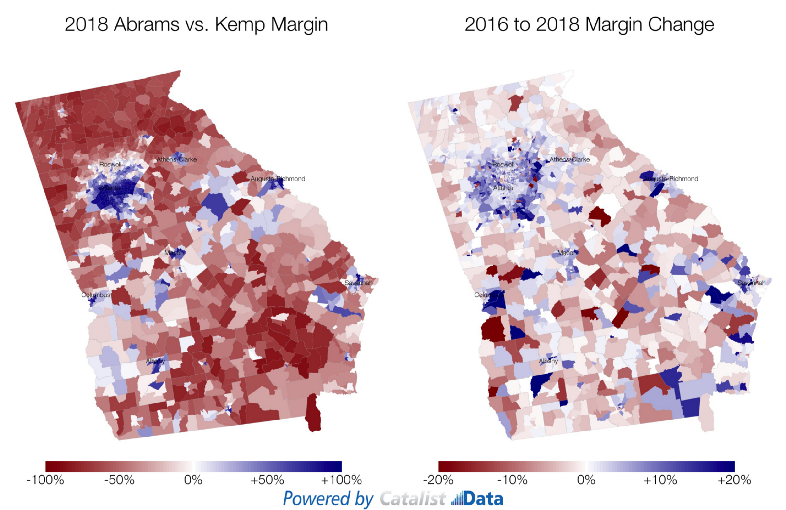
In Georgia, 2018 continued the growing polarization in vote choice between rural, suburban, and urban areas, although it is important to note that this trend did not necessarily continue nationally. First, let’s take a look at where these changes took place on the map.4Maps are from data projected to Census Tract, so that they can be mapped comparably across election years. The data has much smaller sample size and therefore has more uncertainty in rural areas, particularly in the Southern part of the state. Abrams did very well in Atlanta and the other major cities in Georgia, with big changes happening in suburbs just outside of Atlanta. This change is explained in multiple layers: larger Democratic vote share among white voters in suburban areas over time, and a changing composition of the electorate.
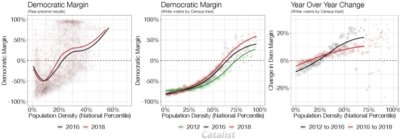
The left-hand graph above shows the raw precinct results from 2016 to 2018, ordered by population density. In both 2016 and 2018, Democrats did better in denser, urban areas. But we can see that Abrams’s improvement came from suburban and urban areas. Interestingly, and unlike some other areas of the country where the rural population is overwhelmingly white, Georgia has many African Americans in rural areas, which explains why the curve isn’t consistent through the whole graph.
When we focus only on white voters, we see a clearer trend: White voters in rural areas are more Republican than in urban areas, and that has been increasing over time. 2012 to 2016 showed a big change in this direction, and 2016 to 2018 continues that trend to a lesser degree.5The middle and right-hand plots use census tracts instead of precincts, to make results comparable across years.
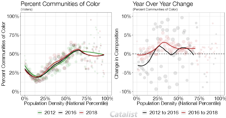
This isn’t the only thing happening in these areas, though. Across the state overall, Communities of Color increased as a share of the electorate by 3 percentage points. This change was largest in suburban areas, with essentially no change in rural areas.
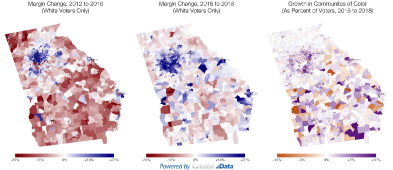
It’s interesting to see where these changes are happening on the map. Changes are clearly happening in and around Atlanta, but the timing and nature of the changes are different in different places. From 2012 to 2016, white voters on the North side of Atlanta trended Democratic (compared to more rural parts of the state that trended Republican). From 2016 to 2018, the pro-Democratic trend among white voters extended to the South side of Atlanta. Meanwhile, the biggest growth in turnout among Communities of Color seems to have occurred more on the East side of Atlanta. All of these are happening at the same time, contributing to the overall Democratic gains in the Atlanta region.
A brief methodological detour
A question that many people have asked us, is how do you know that these estimates are any good? As we have noted, there have been public reports on the initial composition of the vote in Georgia that we can compare to estimates shared in this memo. Below we show our estimated composition of the electorate for age and race (race is self-reported for the vast majority of voters in Georgia), compared to the initial reports of composition from the Georgia voter file. Our estimates of the demographic composition of the electorate are never more than 1–2 points off of the final result, giving us confidence that these early estimates are accurate (for Georgia and other states too, since the methodology is consistent across states). When we receive final vote history, we will update our models and estimates accordingly.

